What a responsive logo is
Do you know what a responsive logo is and how important it is for your brand?
In this article I want to tell you about this new trend in branding, which day by day is becoming more essential for the correct use of a brand and optimizing its presence in different digital media.
The use of different devices with varying screen sizes creates the need to design logos that adapt to diverse scenarios.
These variables allow the brand to be applied in any medium, be it print, digital, web, video, multimedia or Apps for mobile devices.
Therefore, a responsive or adaptive logo is a brand with great versatility, capable of adapting to all kinds of changes in size, format or spaces, without losing its essence, legibility and identity.
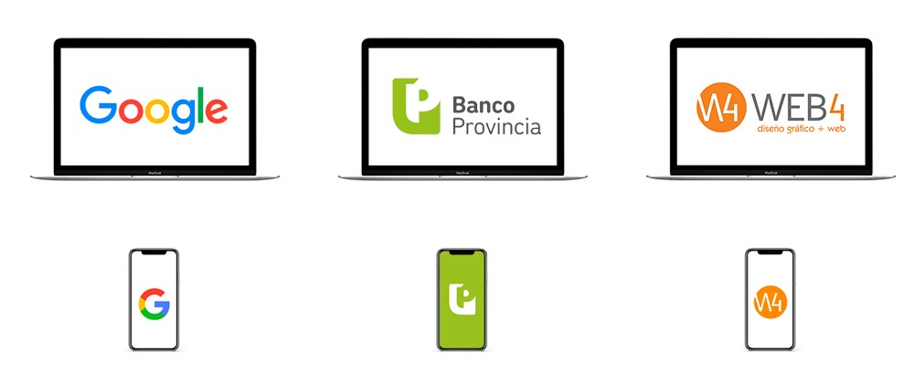
Its origin in web design
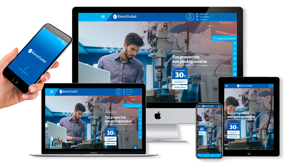
The concept "responsive" has its origin in web design, which emerged a few years ago before the rise of mobile devices, and the need to automatically adapt web content to different screen widths.
And that is why we normally design in 3 basic sizes: PC, tablet and smartphone.
Many companies decide to create a downloadable mobile App to optimize the web version for smartphones, with a design much more simplified still.
This has led to name "responsive brands" to those that allow adaptation and simplification by eliminating unnecessary elements, depending on the device in which they are viewed.
Corporate identity
The variants of a logo in terms of its composition, shape or size are not new.
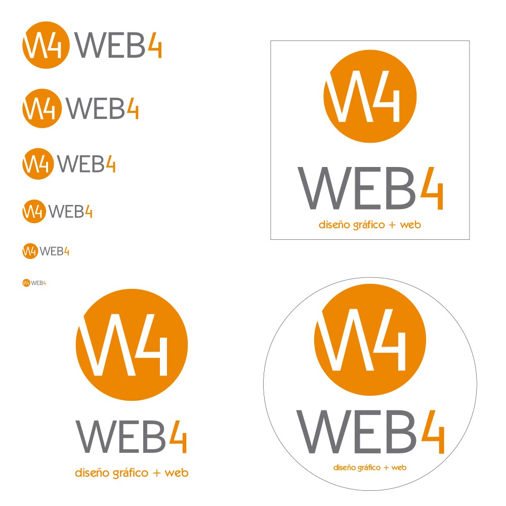
In the corporate identity manuals, in addition to indicating shapes, colors and fonts, graphic designers have always included a section where we subjected the brand to a reduction test, and we could verify that the brand worked perfectly in small sizes up to 1 cm .
Sometimes a variant was even made, eliminating superfluous elements of the brand for when it had to be used in very small spaces.
We also presented different locations of the brand: horizontal, vertical, circular and square, taking into account its possible applications.
Of course, we thought of this based on different methods of graphic printing or corporeal realization of the brand, and not in its application in digital media, much less in mobile devices, since they did not exist yet.
In fact, the smallest branding app we envisioned was on a promotional pen or a graphic ad footer.
But the digital world has made us evolve to optimize the presence of our brand in all the media within our reach, and this is how the concept of responsive < was born and grows
The following images shows the legibility test at different sizes, and the various adaptations to horizontal, vertical, square and circular shapes, optimizing the space that contains the brand.
A matter of adaptability
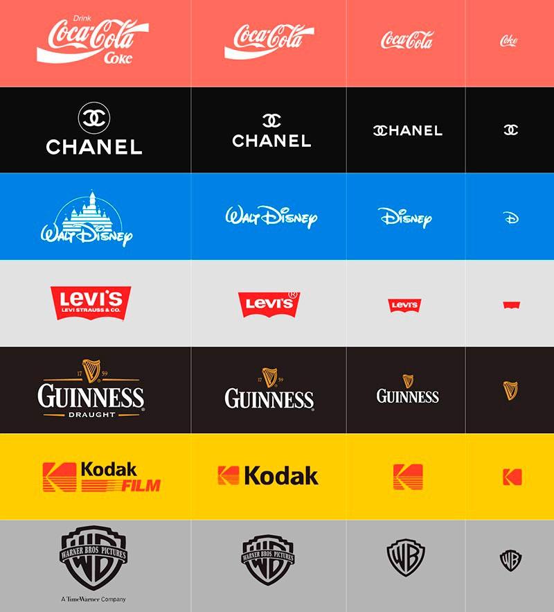
Joe Harrison is a London based designer specializing in digital and interactive design, who experimented with several examples of big brands, this term of responsive logos.
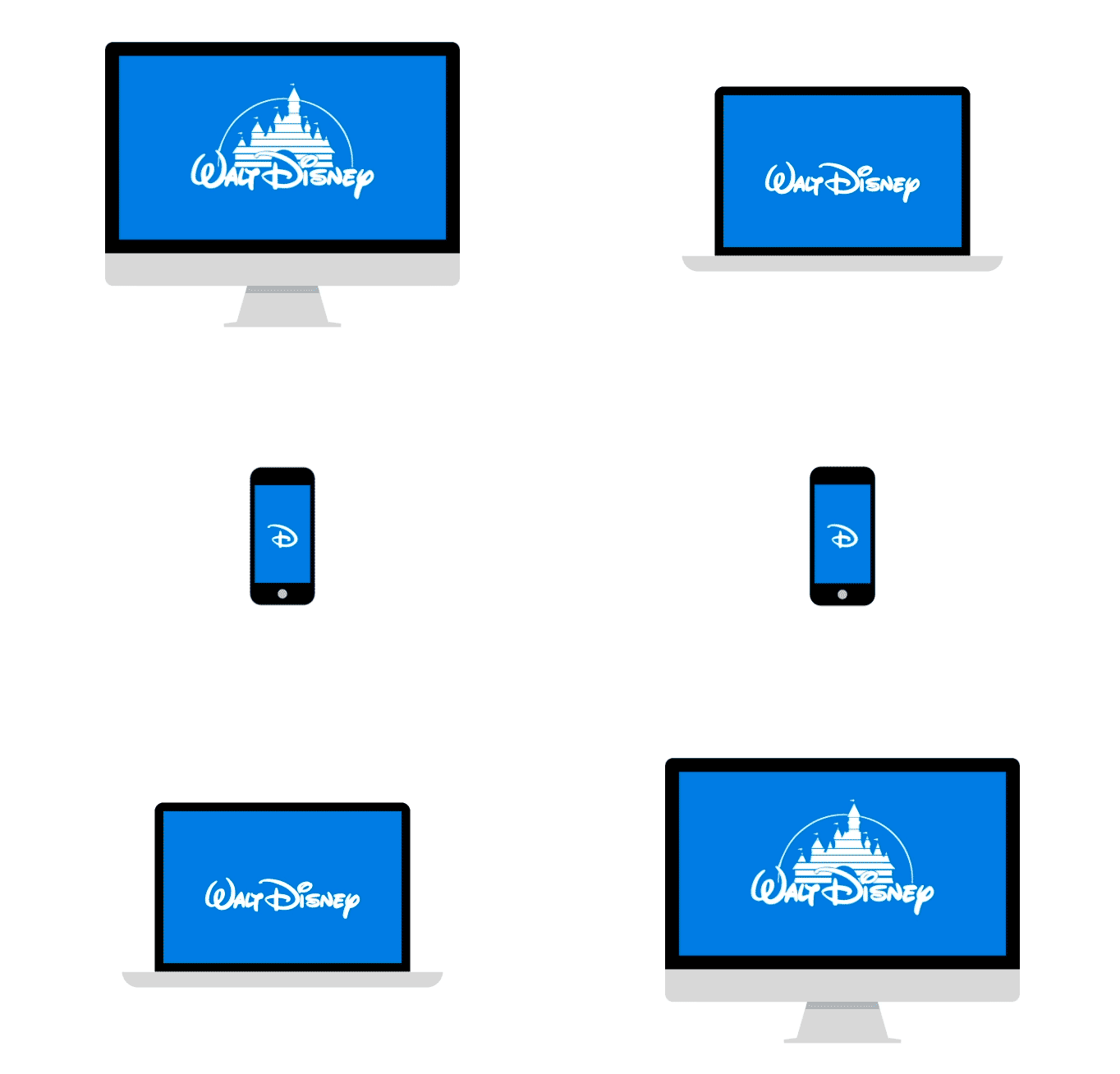
The following image shows how these marks behave when resizing the window of the different devices (desktop PC, Tablet, Smartphone and mobile Apps)
Brands that in their complete expression have many elements that are simplified or eliminated until they reach their minimum expression, but are equally identifying.
Why have a responsive logo?
The diversity of corporate communication options in the current market (and also in the future) requires the intelligent design of a flexible and adaptive brand.
This should allow its application in all its variables, without losing visual identity and maintaining a graphic coherence in all its versions and applications.
That is why it is necessary to “iconize” the brand identity and reduce it to its minimum expression.
A design for every need
Many companies need to apply their brands in various media depending on the occasions.
Corporeal canopies, institutional stationery, advertisements, publications, mailings, digital communication, web sites, online stores, social networks, merchandising items, are some examples.
Sometimes it is required to show the full logo and sometimes only the icon, depending on the size of the surface where it should be applied.
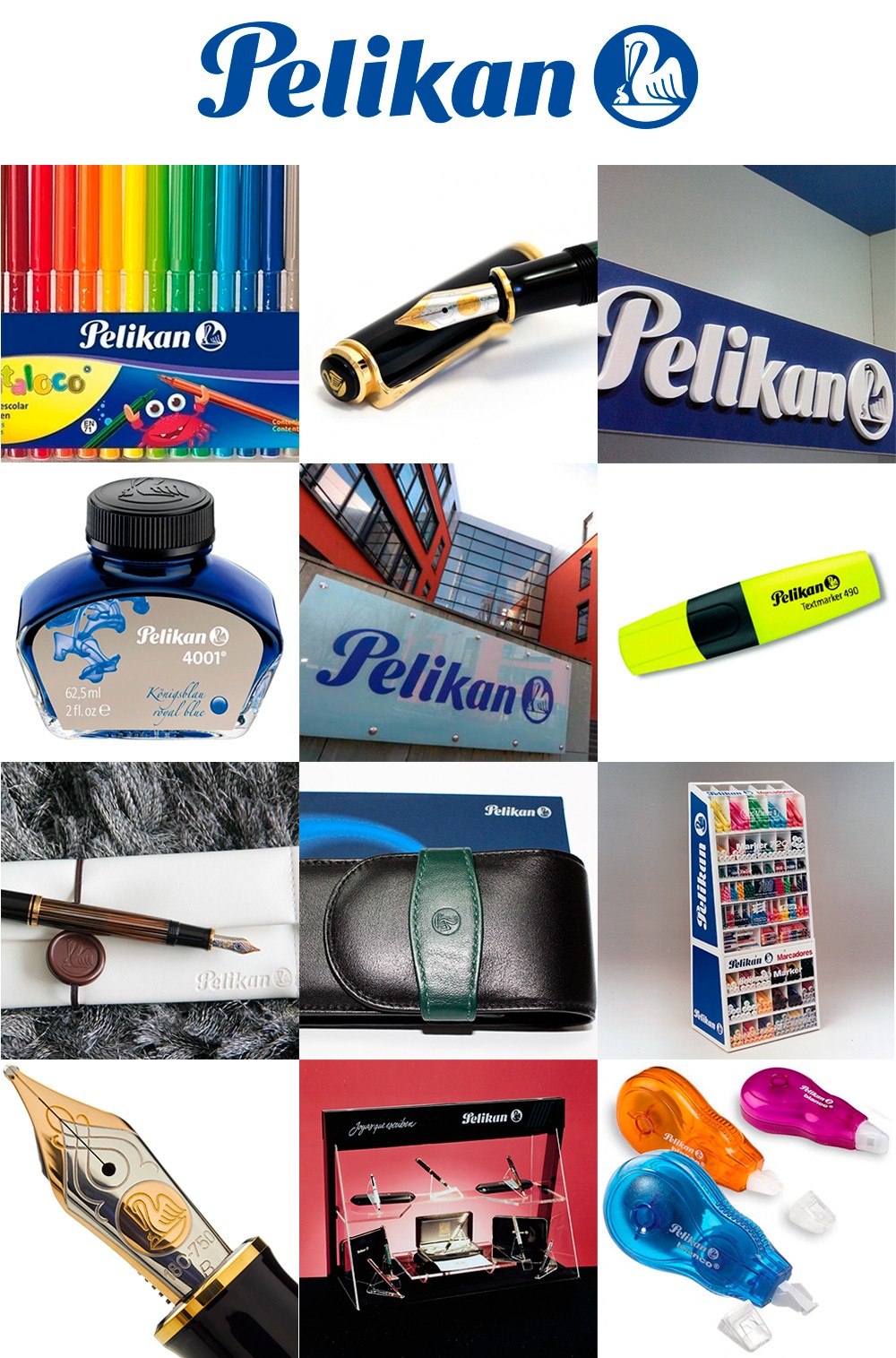
The design of the brand must support any means of graphic printing, industrial, audiovisual or digital production, without losing presence, identity or legibility, in all its sizes.
In the following images we can see the correct application of a brand in extreme sizes, from a marquee to an engraving on a pen and with different means of reproduction, realization and materials.
Unify graphic criteria in brand communication
Such as web design, brand design has not been left out of this new way of adapting to different sizes and media.
This makes the responsive concept also apply to the visual identity of a company or product.
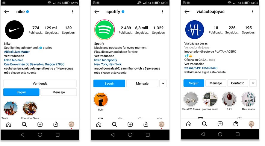
The increasing need to strengthen the corporate presence and set a trend in digital media, especially in social networks, make responsive brands favor online marketing and improve commercial competitiveness.
In the following images we can see a correct use of the responsive logo in corporate Instagram profiles.
We know that the mobile is the device with which we access the Internet the most today, and that is why the importance of adapting the brand is vital to have a better image on the web.
For this reason, graphic designers must know the concept in depth. “responsive”, entender cómo funciona y saber aplicarlo a la creación de nuevas marcas.
It is also valid when it comes to assuming the rebranding of many of them, and above all, getting our customers to understand their importance and the benefits of having an “off-road” brand.
The importance of redesigning
I want to show you a graphic example with my own brand (Web4) and tell you what led me to propose a total redesign of the existing logo.
After taking a course on Marketing on Instagram , I realized that something was wrong with my brand.
While my logo was correct and worked very well on my responsive website, its design was not optimized for social media.
That is how I decided to change it almost completely and start a new stage, keeping the colors and elements, but totally changing the graphic concept.
In the examples that you will see later, I am going to show you the differences of applications of both versions of the logo on Instagram so that you understand why I decided to change it and the results I obtained when doing so.

What requirements should a responsive logo have?
Identity, simplicity and cleanliness are the essential factors of any brand design.
The goal is to bring the conceptual idea to a minimum without losing identity.
This minimalist concept is of vital importance in the creation of a new brand, or in the restyling of an existing brand.
Although we increasingly have better screen resolutions on devices, we must be able to solve a visual corporate identity in different qualities and resolutions.
We must start from the most complete to the most essential and recognizable, dispensing with graphics and fonts that may accompany our logo.
All size and legibility options should be considered in advance and not left to chance.
Therefore, any corporate identity project must be developed taking into account the behavior it will have on the different media, traditional or digital.
The following example shows us how the design of a responsive symbol behaves in different screen widths.
We can see how it is dispensing with superfluous details as it shrinks, but without losing the original concept: The icon always represents a house, there is no doubt about that.
"Mobile First" mode
Thinking in "Mobile First" mode can help us a lot to understand the responsive concept.
This means taking into account from the beginning of creation that the logo will be used in your minimal expression on a wide variety of mobile devices.
Like web design, we must know in advance what are the essential elements that should be displayed on minimal supports, and then add the other secondary elements on larger screens.
Therefore, the premise is to make sure to show first the essential and then add the complementary.
In this way, those who access our content from a small device can satisfy their basic needs for which they have reached our website or our brand.
Just as websites adapt and modify their composition depending on the width of the device screens, brands are taking a similar behavior.
Elements of a responsive logo
In order to create a responsive logo, we must identify what is the most significant and recognizable element of our brand.
As a general rule, it is best to create four designs: for a smartphone, tablet, laptop and pc.
A logo should have 4 basic versions that must be created to be considered responsive:
- Full logo: Name + Icon + Description (tagline)
- Logo without Tagline: Name + Icon
- Name only.
- Icon only

The importance of the Favicon
A favicon is an icon that is created to give identity to a website.
Its name comes from "icon for favorites" since that was its initial function: recognize a website in a Favorites list in the browser.
Today this concept goes beyond a simple identification, and that is why we use this icon for all types of brand identity: social profiles, mailings , mobile apps, etc.
Read my article " The most important guide to understanding logos " for more information.
Typically, all social media profile photos are cut out in a circle or square.
This is a very small space that we have to make the most of in order to show our brand.
Therefore, the responsive icon of a brand must fit perfectly within that cut and thus take advantage of its communicational value.
We must bear in mind that this favicon usually has a very small size, and heads the identification bar of browsers.
It is also displayed in email headers, list of favorite sites, phone contacts, WhatsApp, social media profiles, etc.
In the example of the following image you can see the difference in readability and strength values of the brand identity, even in reduced sizes of 32 and 16 px.
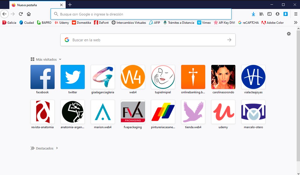
In the following images I show you some of the places where our responsive logo or favicon is displayed:
1. In the browser that identifies the web
2. In the Favorites menu
- Green: Web with Favicon
- Red: Web without Favicon
- Blue: Google account identifier
3. In the list of most visited sites
4. In the list of emails
- Green: Mail with Favicon
- Red: Mail without Favicon
5. On Facebook fanpage
- Account Profile Picture
- Identification in post
- Viewing as an account follower
6. On YouTube channel
- Account Profile Picture
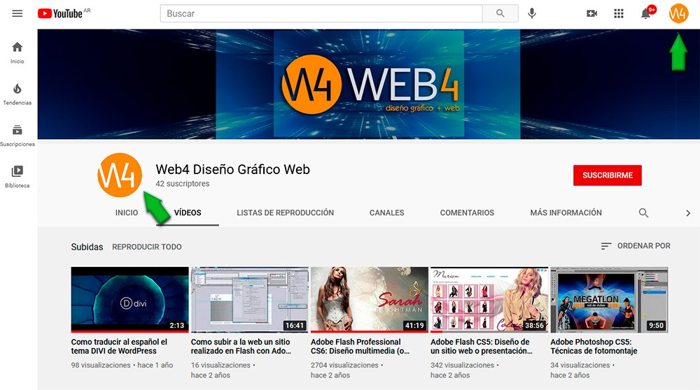
As can be seen in the previous examples, a favicon is not only a graphic to identify a website in favorites, but we can visualize it in many other applications.
In all of them it helps us to strengthen the identity and presence of our Mark.
New times and the digital environment
Without a doubt, the greatest benefit of having a responsive logo is going to be obtained on social networks.
It is very important to create a brand presence by paying special attention to the design of our social profiles.
The Instagram profile image does not need to show the full logo, as the name is written in the account description.
That is why we only resort to the application of the responsive logo, trying to center the design within the circle.
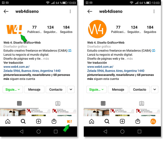
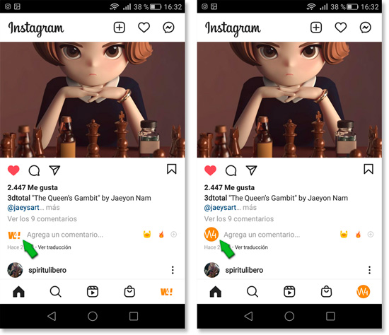
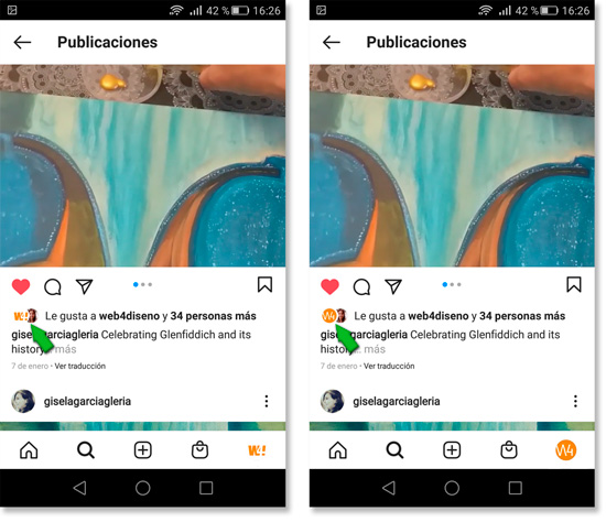
In the next examples I will show you the differences between applying a non-responsive logo and a responsive logo on Instagram profiles.
Pay attention to which ones have better readability and institutional presence in all sizes.
You will notice that the logos are getting smaller and smaller in the different instances.
1. Company account profile
- Profile image
- IG account switcher
2. Display in «Comments»
3. Display in «Likes»
Final conclusion
I hope you have enjoyed this article and it has been useful to you.
As you may have seen, the display of the logo in the different posts is less and less and that is why it requires a design that allows its readability in extreme sizes.
With these examples I hope I have made it clear to you the importance of using a responsive logo to create a presence of your brand in digital media.
To summarize this article, we can say that Simplicity, Minimalism and Legibility are the keywords to enter your brand identity in the virtual world.
If you wanted to have your brand responsive and you consider that I am a suitable professional, do not hesitate to contact me and I will advise you with great pleasure.
In the Related Articles section below, you will find many articles with specific topics that complement the one you just read. Thank you!

