40 famous brands that have redesigned their logos

In this post, we're going to talk about rebranding by analyzing 40 famous brands that have redesigned their logos.

We will also study and analyze how their designs evolved over the years.

A brand's redesign is about its history and the times it faces in terms of fashions, trends, and needs.

But the evolution of the brand itself also has an influence.

We will see that there are many brands that were originally born as products that are not what they represent today.

Other brands have been expanding their products into various markets, which has motivated them to redesign their graphic identities.

That's why we're going to talk about the history of some brands and learn about the unique features that led them to become what we know today.

This article complements a previous one “Rebranding: the importance of redesigning a brand”, and I invite you to read it.

>>> I WANT MY LOGO <<<

Packaging posavasos

Rebranding, redesign and restyling

We have heard these terms many times and many believe that they are the same concept, but they are not.

We won't go into detail on this topic because that's not the purpose of this article, but we will give a general idea.

Branding relates to all aspects of a brand's "personality and values" and is managed through marketing strategies.

It is what people want to perceive about it, involving concepts, sensations, shapes and colors that identify it.

Design is a branding tool that graphically represents those aspects of a brand.

This is what we ultimately identify as our visual identity, and from there we develop a corporate image.

Therefore, redesignis the intensive modification of a brand's visual identity to adapt it to a new desired positioning.

It involves a complete overhaul of the brand's communication strategy and identity, which may include a complete change of the logo, corporate colors, and value proposition.

A brand restyling is an update of the aesthetics, a facelift, but without altering its fundamental essence, preserving its perfectly recognizable key elements.

rediseño de marcas

When brands need to change

There's nothing better to develop this topic than to explain it with examples of world-famous brands that we all know.

You've probably seen many of these logos in their design stages and didn't notice their graphic evolution over the years.

That's why I invite you to explore them and learn about their stories and the reasons for their redesigns.

Click on the icons to see details.

7Up
7Up
Amazon
American Airlines
Animal Planet
7Up
7Up
7Up
7Up
7Up
7Up
Chevrolet
Chupa Chups
Citroen
Disney Channel
Fanta
FedEx
Ford
Gatorade
Google
Heineken
Iberia
IBM
Instagram
Jaguar
KFC
Kodak
Lay's
Levi's
Logitech
McDonald's
Mercedes Benz
Microsoft
Mirinda
Netflix
Pepsi
Peugeot
Pringles
Puma
Windows

7up

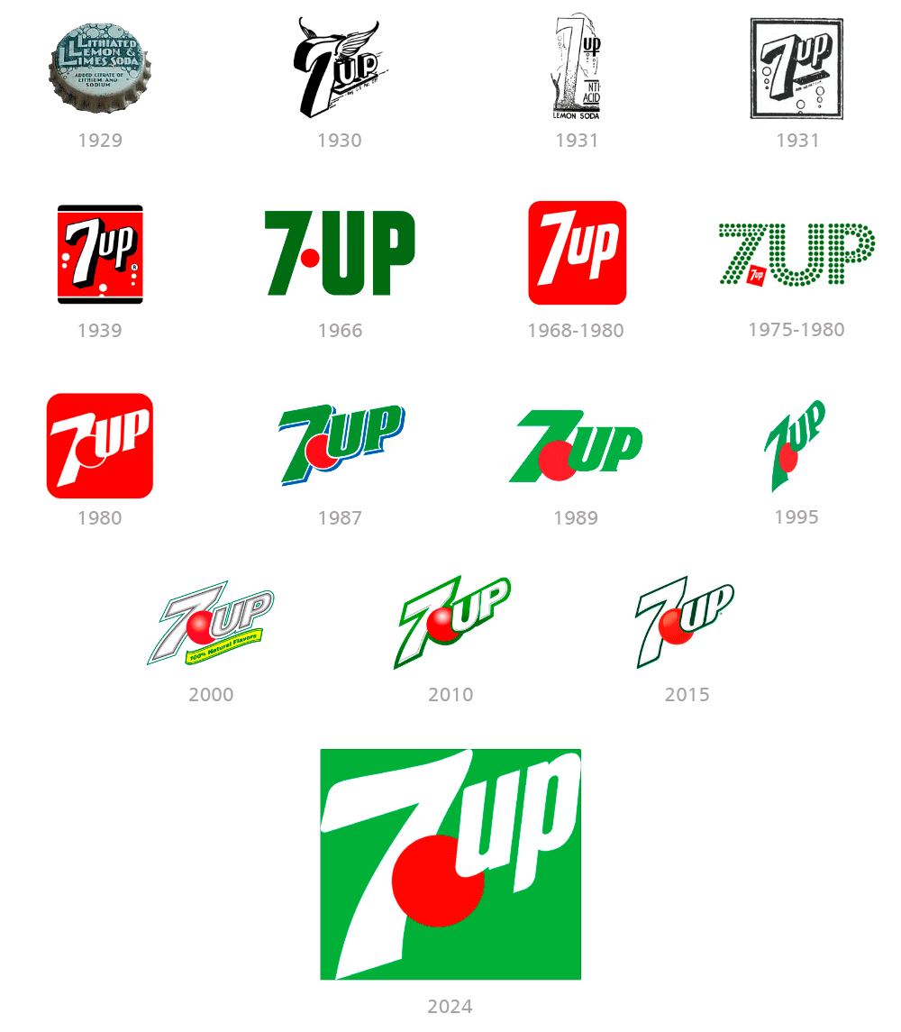
This carbonated drink was born in 1929 with the name "Litiado Lemon and Lime Soft Drink."

Its first logo from 1929 features bold white letters on a dark green background with outlined bubbles of varying size to represent the soda's carbonated nature, on the bottle caps.

In 1930 it was already called 7up with a winged logo intended to represent the drink's ethereal and bubbly sensation.

During the 1930s, the design was stylized with the number 7, which would end up becoming the brand's icon.

From 1938 onwards they decided to add red and black and the brand began to acquire a more precise definition.

The logo varied considerably according to different criteria, sometimes returning to green and other times using red as the predominant color.

Finally, it was decided to assign green to the letters and red to the point that separates both words.

Starting in 2000, the lettering returned to white, contrasting with the green of the bottles with subtle three-dimensional effects.

Restyling logo 7up
7up publi

Adidas

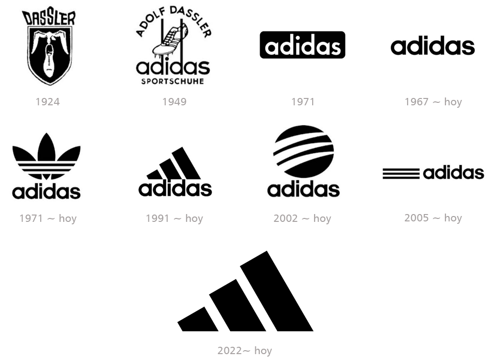
The name Adidas is derived from its founder Adolf (Adi) Dassler and was first used in 1941, with a typography very similar to the current one.

In 1971, in addition to the wordmark, the iconic clover was added and the traditional 3 stripes appeared.

In 1991, the designer added more power and weight to the emblem, maintaining the three stripes, which became bolder.

The minimalist design evokes a sense of movement and upward progression, symbolizing the athletic rise of Adidas's clientele and the brand's forward-thinking approach.

The bars vary in length, creating a dynamic visual rhythm that conveys speed and agility, while also demonstrating the concept of a competitive podium.

This contemporary interpretation of the classic motif retains the heritage of the original while adopting a sleek, modern aesthetic.

With the arrival of the new century, the three stripes took on a lighter and more refined appearance, traversing a black circle that represents the world.

In 2022, the 1991 concept returns, but with the option to omit the wordmark, as an avatar for social media and web applications.

Restyling logo Adidas
adidas publicidad

Amazon

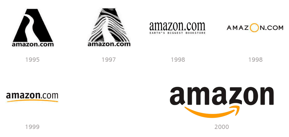
Amazon is the giant of online shopping and its logo reflects that concept.

The current logo was designed in 2000 by Turner Duckworth under the supervision of company founder Jeff Bezos.

The orange arrow of the logo leaves the letter "a" and ends in the letter "z", indicating that they sell all the products you want, from a to z.

The arrow also represents a smile, in which the tip is a stylized dimple or a line of expression, which gives a wink of sympathy, joy and confidence.

This smile represents the happiness that people feel when they buy on Amazon, since the company wants the best customer satisfaction, offering a friendly service.

The black typeface demonstrates Amazon's superiority and dominance in the online retail market, which has been demonstrated by its financial metrics.

The bright orange color detracts from the formality of the logo and adds energy and appeal.

It also symbolizes pride and happiness, showing how Amazon works and thinks.

This great logo has become a benchmark in world brand design.

Restyling logo Amazon
amazon publicidad

American Airlines

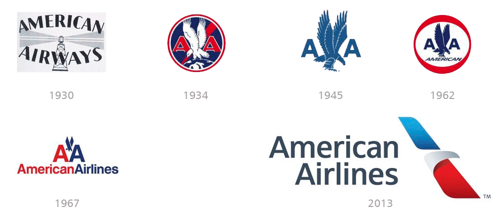
The original American Airlines logo was created in 1934 by Goodrich Murphy.

It features a white eagle perched on the globe with its wings spread upward, showing the infinite possibilities and power of the enterprise.

The airline's visual identity's blue, white, and red color scheme is not only a tribute to the U.S.A. but also a powerful combination, perfectly reflecting the company's influence, professionalism, and authority.

The brand evolved over the following years, maintaining the original concept and adapting to the trends of the times.

The current logo was completely redesigned in 2013 by the marketing agency FutureBrand.

The result is an elegant and memorable brand that represents the head of an eagle; one of its wings is red and the other blue.

The logo reflects freedom and the struggle for success and was named the Symbol of Flight.

Restyling logo American Airlines
american airlines publicidad

Animal Planet

Animal Planet is an American news television channel established in 1996, owned by Discovery and dedicated to documentaries and series about animals.

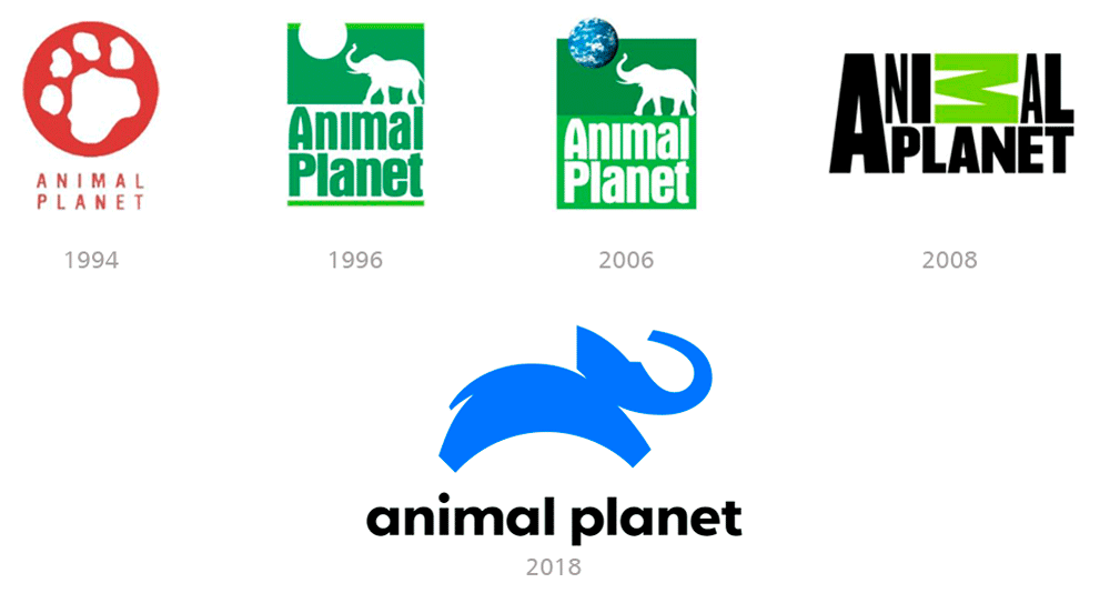
But the first Animal Planet logo was created in 1994 when it was not yet a television channel.

It consisted of a white big cat claw drawn on a solid red circle, using the same shade of red as the logo.

In 1996, the channel was created and a more ornate and detailed logo was designed, represented by the profile of an elephant pointing its trunk toward the sun.

A restyling of the brand was carried out in 2006, where the sun was replaced by a three-dimensional image of the Earth, making it appear as if the elephant was playing with the planet as if it were a ball.

The 2008 version is completely different through a drastic redesign, removing all graphic elements from its visual identity.

The only bright detail is the green letter "M", which is located horizontally above the rest of the black letters, simulating a jungle environment.

Finally, in 2018, the elephant returns to Animal Planet's visual identity, but today it is a contemporary, more abstract and almost childlike drawing.

The stylized blue animal now moves to the right, toward tomorrow, as a symbol of progress and development.

The logo is modern and friendly, and its color palette adds freshness and youthfulness, evoking a sense of loyalty and reliability at the same time.

Restyling logo Animal Planet
animal planet publicidad

Apple

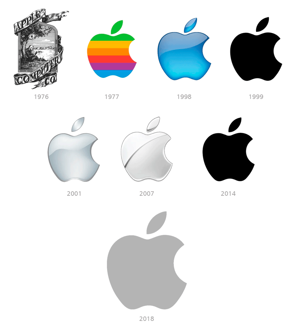
The Apple logo has had several iterations throughout its history, from the complex original design to the recognizable bitten apple.

The original 1976 trademark was designed by Ronald Wayne and is not morphologically considered a logo but an emblem.

It shows Isaac Newton sitting under a tree and was considered too complicated and difficult to reproduce on a small scale.

In 1977, Rob Janoff created the iconic rainbow-colored bitten apple, a simpler and more recognizable design that remains to this day.

When trying to simplify the symbol of the company, Yanoff wanted to place the image of the bitten apple since the word "bite" in English is bite, so it is translated as a term in computing (which is byte, like gigabyte, megabyte , etc.).

Steve Jobs returned to Apple in 1998 and decided to update the logo while maintaining the concept that was already successfully established in the market.

It adopts a monochrome and minimalist version of the Apple, in line with the company's new aesthetic.

Since then, the same concept has been maintained, varying only in the colors and three-dimensional treatments, which were very common at the beginning of the 21st century.

Restyling logo Apple
apple publicidad

Bayer

Bayer is a German multinational pharmaceutical company, one of the largest in the world, founded in Barmen in 1863 as a dye factory.

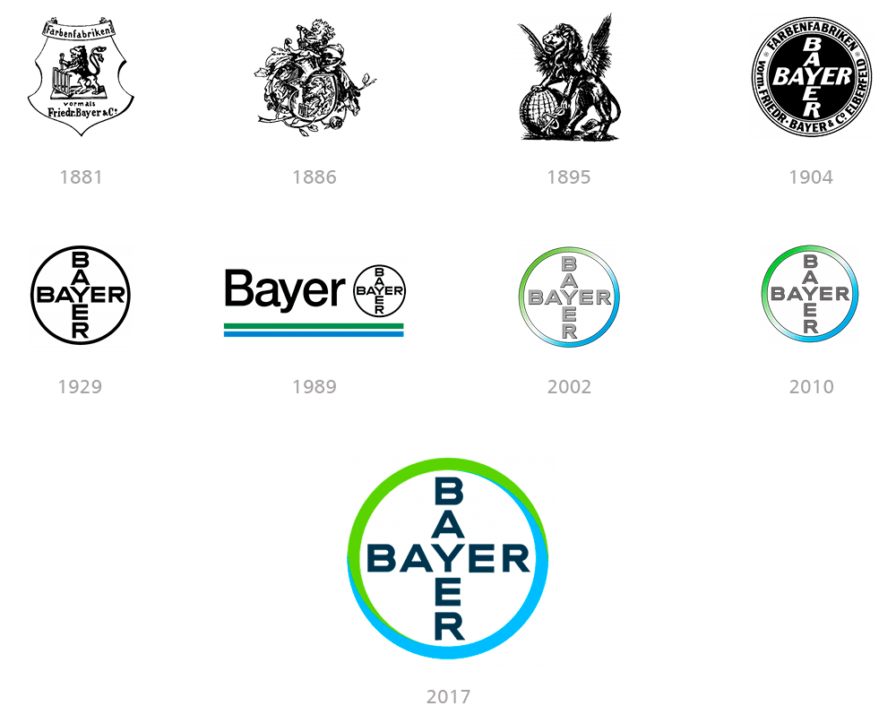
But Bayer didn't develop a logo until 1881, and it consisted of an illustration of a lion based on the coat of arms of Elberfeld, the town where the company was headquartered at the time.

The 1904 logo consists of two crossed words BAYER sharing the letter "Y" and enclosed in a circle, and is the brand concept that endures to this day.

The Bayer logo becomes one of the world's best-known trademarks.

A milestone in the logo's popularity and a clever marketing idea was the decision to print the new logo on tablets, especially aspirin.

The Bayer logo has remained almost exactly the same for over a century and works equally well in large and small sizes, with or without color.

In 1989, two lines of dark green and blue were added, colors that soon became typical of Bayer.

The year 2002 saw the first colored version of the Bayer Cross, in the blue and green colors that symbolize the brand's modernity and freshness.

In 2017, following a successful graphic evolution, the color gradients in the circle disappeared and the colors were modified.

This makes it easier to use the logo in digital media and gives the brand a more modern and updated look.

Restyling logo Bayer
bayer publicidad

BMW

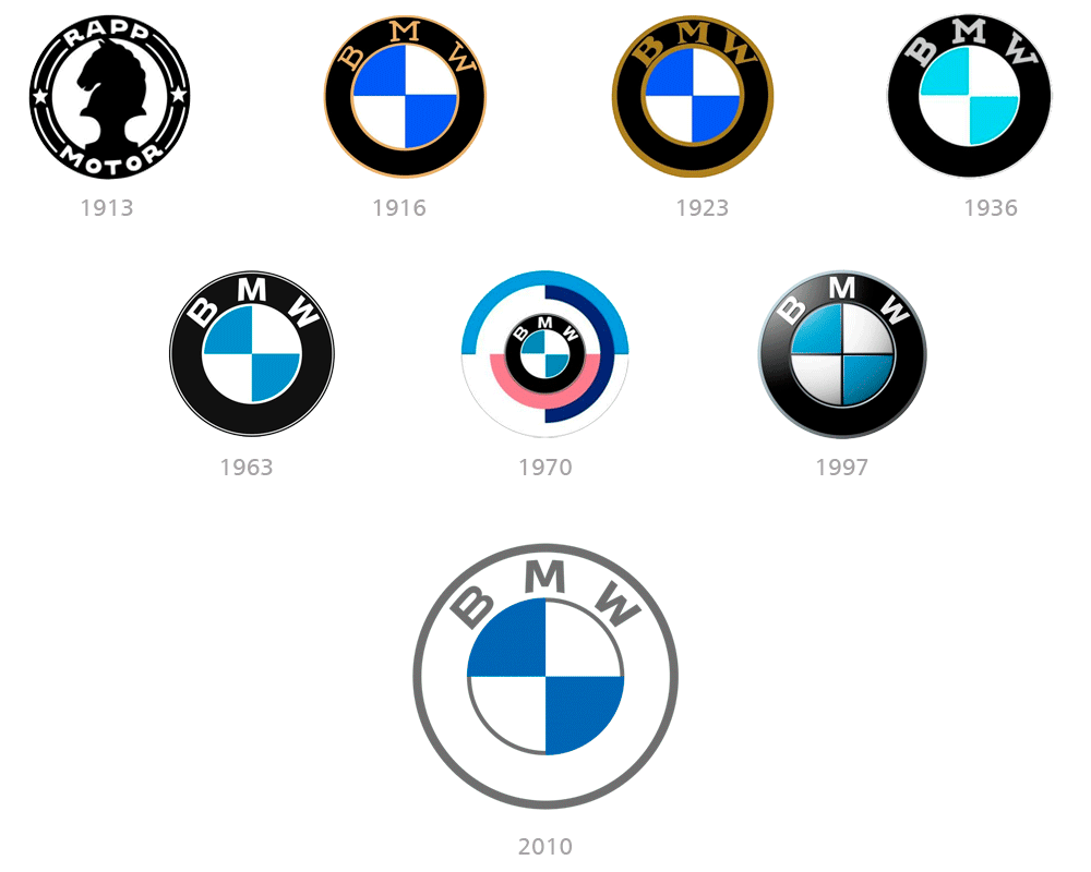
The iconic car manufacturing company BMW was established in 1913 as RAPP Motorenwerke, specializing in the production of aircraft engines.

In 1916 it changed its name toBayerische Motoren Werke, or simply BMW.

The logo design appeals to the Bavarian flag, which alternates between blue and white diamonds.

It also evokes an airplane propeller spinning at high speed, representing the company's value, legacy, and roots.

BMW's most recognizable and distinctive logo was created in 1997 and will remain official until 2020.

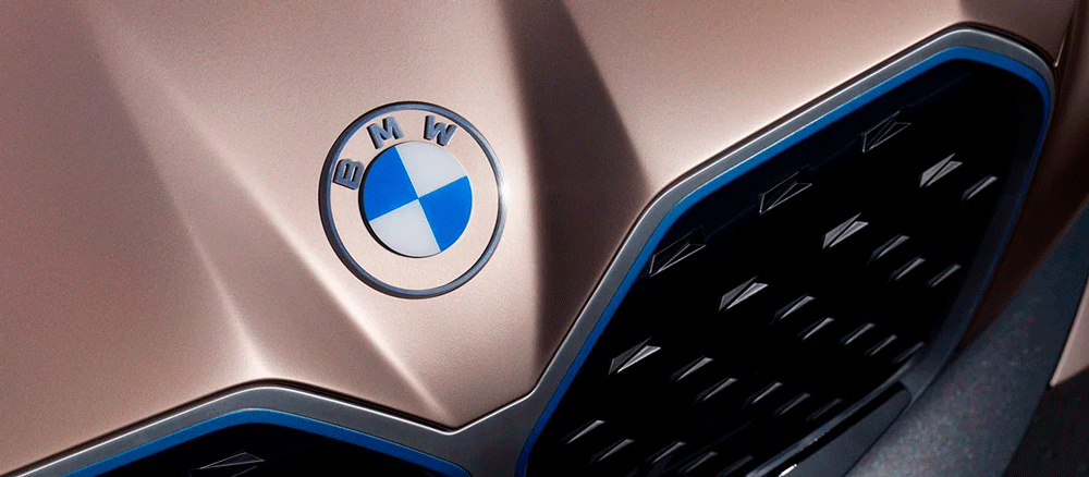
But even after the introduction of the new design in 2020, the old badge still remains on the hoods of iconic German cars.

In 2020, the company went minimalist and redrew its logo in 2D, eliminating the black color.

The emblem now features a thin grey outline and a thick white frame, where the grey inscription “BMW” is placed in a slightly expanded modern typeface.

The logo looks fresh and cool, reflecting the brand's progress and its willingness to move into a new era.

Restyling logo BMW
bmw publicidad

Budweiser

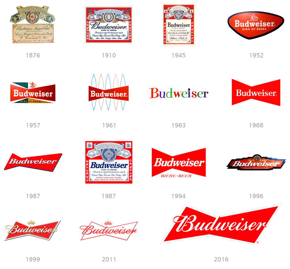
Budweiser is an American lager beer, first introduced in 1876

Today, the famous beer is distributed worldwide, making it one of the world's leading brands in its segment.

Known as The King of Beers, Budweiser has a striking and instantly recognizable logo, which has undergone many redesigns throughout the brand's history.

The first three versions of the beer logo were highly ornate, based on the seals and coat of arms, with many additional letters.

In 1952, it began to become more minimalist and bold, to satisfy the tastes of a younger audience and general progress.

The iconic red bow tie first appeared in 1957 and remains a staple today, with design variations that reflect the needs of the times.

The current logo is a simplified version of the previous ones.

The two-color flat design has no additional details, just the red background and white lettering.

It looks sleek, professional, and very modern, despite the use of an old-fashioned script font.

Restyling logo Budweiser
budweiser publicidad

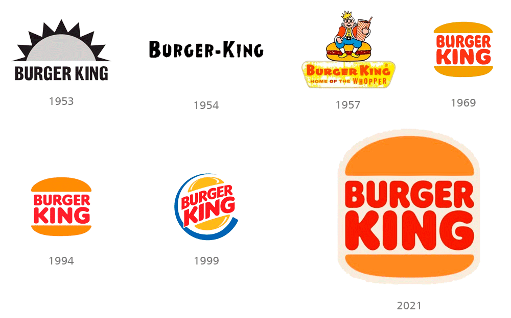
Burger King

Burger King is a pioneer in the fast food market and boasts that quality.

Over the decades, it has maintained a style consistent with its identity with very subtle changes in its design.

The 1970s marked the global rise of these companies, where hamburgers were the real stars.

The brands were quite similar in their colors, but they managed to maintain their identity and branding concepts.

Burger King's recent 2021 logo redesign returns to a more minimalist design closer to its 1969 logo.

It seeks to project a more realistic and appealing image of food, evoking that sense of nostalgia and authenticity from the 1970s.

It presents a more modern and clean image, eliminating unnecessary details and seeking to connect with the brand's history and memory.

The warm, bold color palette focuses on tones reminiscent of grilled food, creating a more authentic and appetizing look.

Restyling logo Burger King
burger king publicidad

Carrefour

The name Carrefour comes from the first store opened in France, which was located at a crossroads.

That's why the company decided to name it Carrefour, which in French means "crossroads."

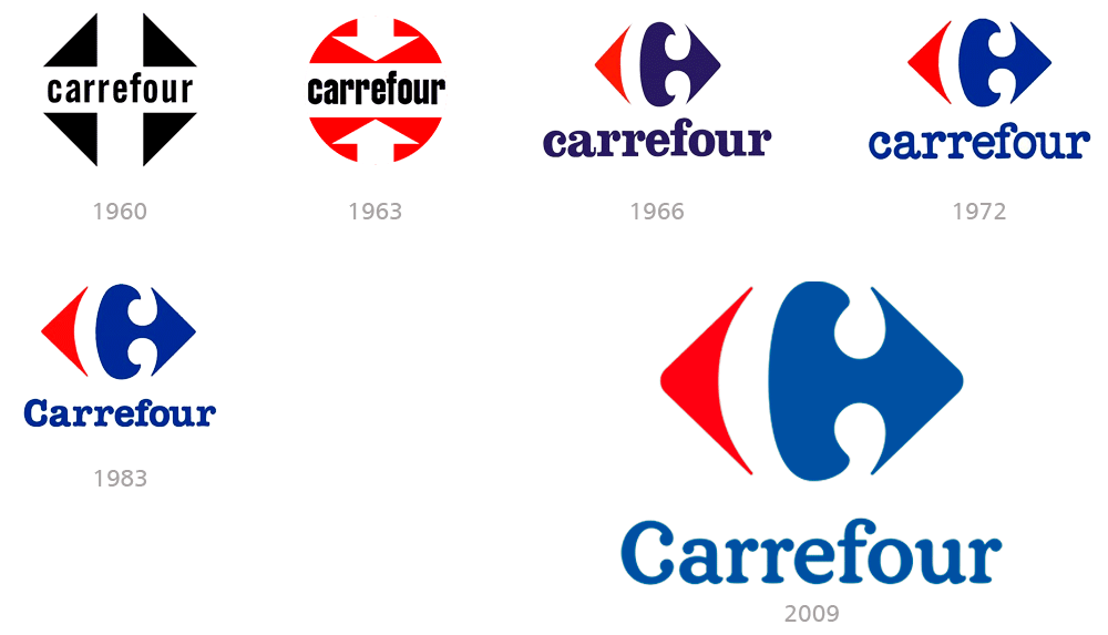
The logo, at first glance, symbolizes precisely the two paths.

In it you can see two figures representing arrows pointing in opposite directions, one blue and one red.

The gap between them generates a blank letter "C", alluding to the French origin of the brand.

This is one of those cases where the brand hasn't needed major redesigns and has managed to survive for decades without any notable changes.

The same concept of identity is always maintained, applying only very subtle changes.

The current logo is executed in an elegant serif typeface with its clean lines and rounded serifs.

Restyling logo Carrefour
carrefour publicidad

Chevrolet

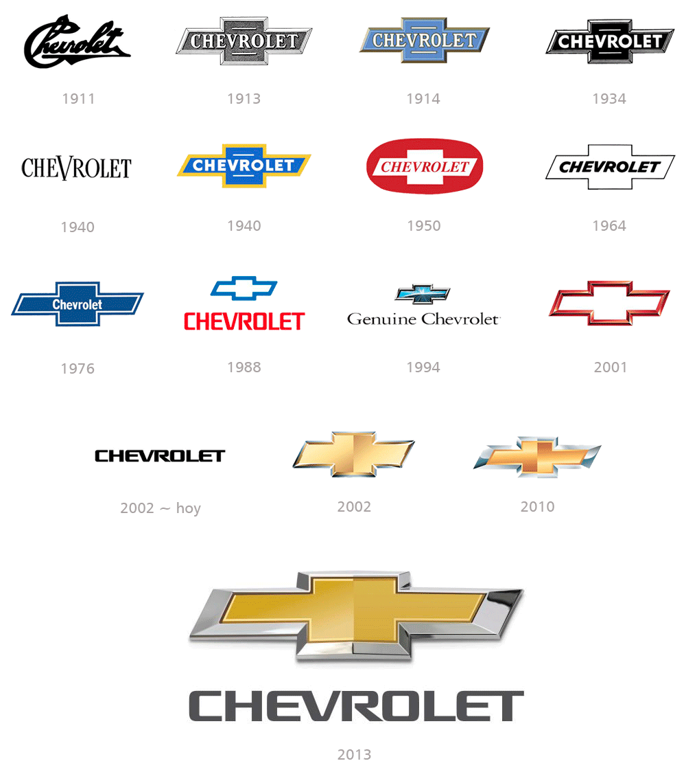
Chevrolet is an American brand that was established in 1911 by Louis Chevrolet and Willian Durant.

Known worldwide as Chevy, it has an iconic logo and is considered a classic of brand identity design.

The logo is nicknamed the "bow tie" and has hardly changed throughout history.

It was designed by the brand's founder, Willian Durant, in 1913.

The Chevrolet bowtie emblem is a broad, stylized cross formed by a horizontal parallelogram overlapping a square.

Over a century of history, there have been many variations in color and detail of the Chevrolet bow tie, but the essential shape has never changed.

In 2002, a new version of the logo was created, and it is probably the most recognizable of all.

This black logo featuring a custom typeface with smooth, thick lines looks elegant on almost any background.

It can be seen in three-dimensional metal on the brand's cars, or in plain black on signs and printed materials.

The latest redesign, unveiled in 2013 to celebrate the company's centenary, maintains the emblem's gold color but makes it more luxurious by thickening the silver frame.

The logo now looks more dynamic and stronger.

Restyling logo Chevrolet
chevrolet publicidad

Chupa Chups

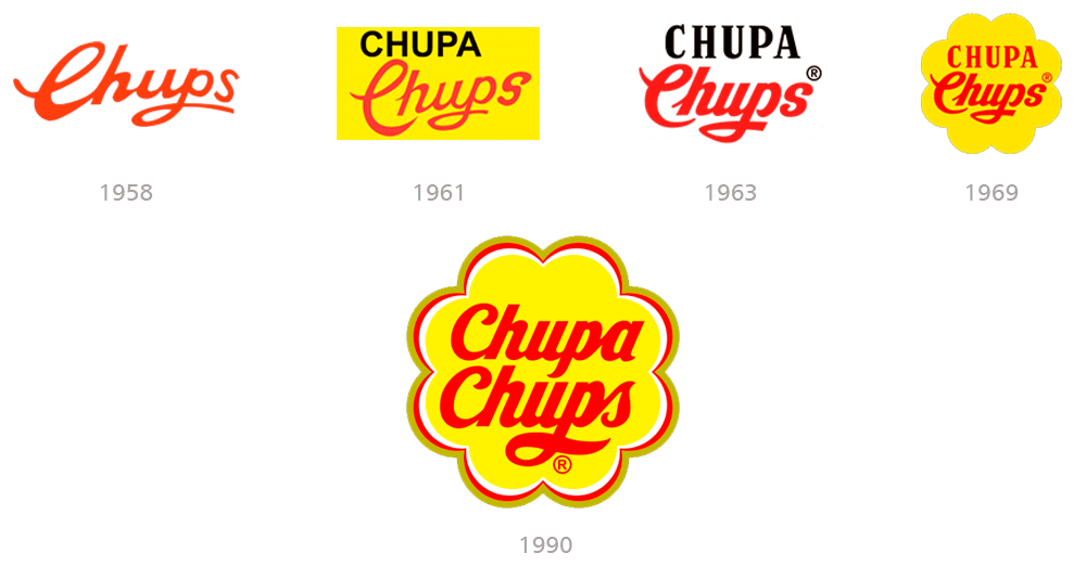
The history of Chupa Chups candies begins in Spain in 1958.

Enric Bernat is the Catalan pastry chef who was responsible for developing the idea of a round candy attached to a stick.

The idea was born from the problem that children would get their hands dirty when they took the candy out of their mouths.

That's why he came up with the idea of developing a novel candy packaging with a new logo that would give it international exposure.

It was then in 1969 that Enric Bernat turned to his friend, the great surrealist artist Salvador Dalí.

Dalí's idea turns out to be extremely simple: place red letters on a yellow background in the shape of a daisy flower.

The peculiar artist agreed to design the brand in exchange for a million-dollar fee, which Enric accepted.

Dalí thought for a while and began to scribble until he designed the daisy logo on a paper napkin.

It took no more than an hour to create one of the most iconic logos of all time.

A novelty was the introduction of the flower shape that surrounds the logo, which turned out to be one of Chupa Chups' clearest identifying features.

Dalí recommends placing the logo at the top of the packaging to enhance its visibility and give it its own personality.

But the most important thing was that when you removed the wrapper, the logo was still intact so you could save that beautiful packaging.

The Dalí logo remained in use for decades, and only in 1990 was a very subtle restyling carried out, ensuring that the essence of the brand was preserved.

Restyling logo Chupa Chups
chupa chups publicidad

Citroën

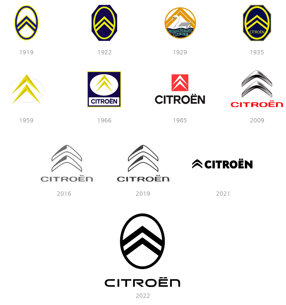
Citroën is a French brand of automobile manufacturing company, founded in 1919 by Andre-Gustave Citroën.

The original Citroën logo was created in 1919 by the brand's founder.

His family business, Engrenages Citroen, initially specialized in the design and production of helical gears.

The original Citroën badge was composed of oval-framed chevrons, executed in fine lines resulting in a sophisticated and lightweight brand logo.

In 1929, the only version of the logo was created where an additional graphic element was added: a white swan with two chevrons and a blue underside, symbolizing water.

This is the first time the wordmark appears in the logo.

In 1959 the logo was redesigned with a modern approach.

The wordmark disappears and the stripes are now three-dimensional, and the brand concept begins to take shape in the identity we know today.

Around 1985, the logo's color scheme changed dramatically, and the emblem consisted of two white stripes in a red square.

The wordmark is now larger, with clear, confident lines in black.

In 2009, the stripes became three-dimensional again, with a color change from black to gray, giving a metallic effect.

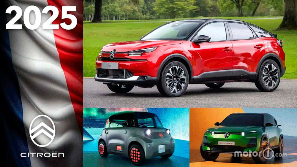
The 2022 redesign creates a crisp, geometric logo that returns to the brand's initial concept, with a clean, futuristic style.

Citroën
citroen publicidad

Disney Channel

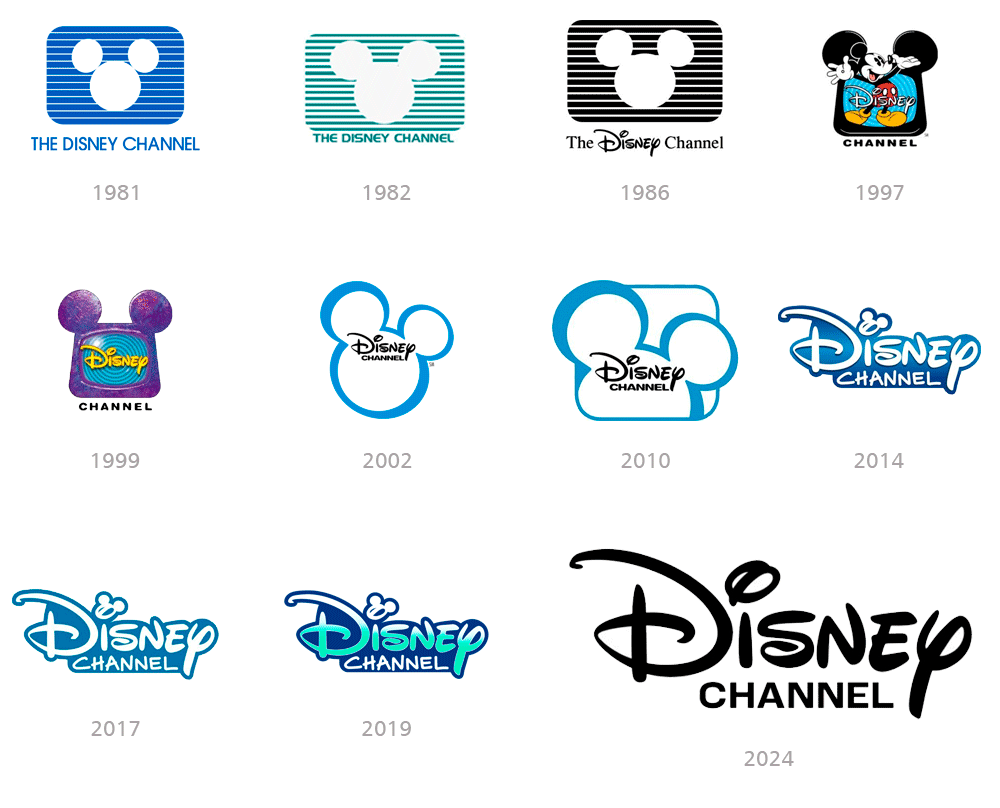
The logo designed in 1981 was used by the brand for less than a year.

The geometric outline of Mickey Mouse's head is cut out of the horizontally oriented rectangle with softened contours, resembling a television screen of that era.

In 1986 the logo was redesigned, changing to black and reducing the number of horizontal lines.

Another major change was made to the wordmark, which now featured a custom "Disney" typeface representing the company's logo.

In 1997, a completely new version of the logo was created, featuring a colorful Mickey Mouse standing with his hands raised as the logo mascot.

In 1999, Mickey Mouse was removed from the emblem and the black television with rounded ears was now purple.

In 2002, the company decided to become minimalist and laconic, maintaining the main features: the unique lettering of "Disney" and the outline of Mickey Mouse.

The new color palette makes the logo look fresher and sharper, allowing it to be placed on various backgrounds.

In 2014, Mickey Mouse's head was replaced by the dot over the letter "I" in "Disney."

The wordmark is now the sole element of the company's visual identity, signaling the company's forefront in the entertainment industry.

Disney Channel is undergoing another redesign in 2024, following the international trend of minimization and simplification.

The iconic Disney logo is rewritten in black, with the letters on a white background without any additional graphics.

For the first time in the company's history, there is no reference to Mickey Mouse.

Reatyling logo Disney Channel
disney channel publicidad

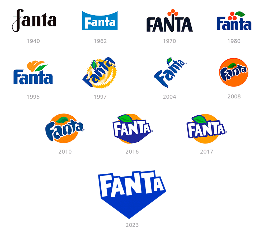
Fanta

The Fanta logo has evolved to reflect the brand's evolution and focus on fun and innovation.

The first logo is a sleek black design with a distinctive “F.”

It then evolved until the 1980s, when it introduced a color combination of blue, orange, and green, with a clear, pared-down typography.

Already close to the 2000s, there was an attempt to play with brush typography and include the concept of the orange in the brand.

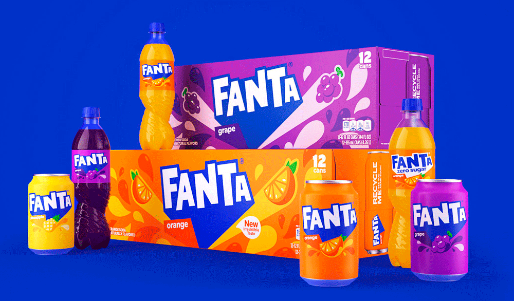
In 2023, Fanta launched a new global identity, unifying its image worldwide with a more modern and simplified design.

It uses angular typography and vibrant colors, seeking to inspire joy and a thirst for adventure, motivating people to take risks and enjoy life.

It no longer focuses its image on oranges, as the brand markets different flavors.

Restyling logo Fanta
fanta publicidad

FedEx

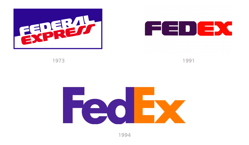
The earliest FedEx logo reflected the original company name Federal Express.

The main reason why its founder Fred Smith chose this name was that he wanted to get the Federal Reserve Bank as a client.

Additionally, he assumed that the word “Federal” might give the company weight by emphasizing patriotism and the desire to contribute to the country's economy.

The current logo was designed by Landor Associated in 1994 and is one of the most iconic brand designs in history.

Its main detail is a white arrow pointing to the right, formed by the negative space between the letters "E" and "X"

This is a subliminal message that shows the essence of the company and evokes a sense of movement.

The design has been so effective that it remains relevant today, surviving all the changes brought about by the digital age.

Restyling logo FedEx
FedEx publicidad

Ford

The Ford logo has become one of the most recognizable logos in the automotive industry.

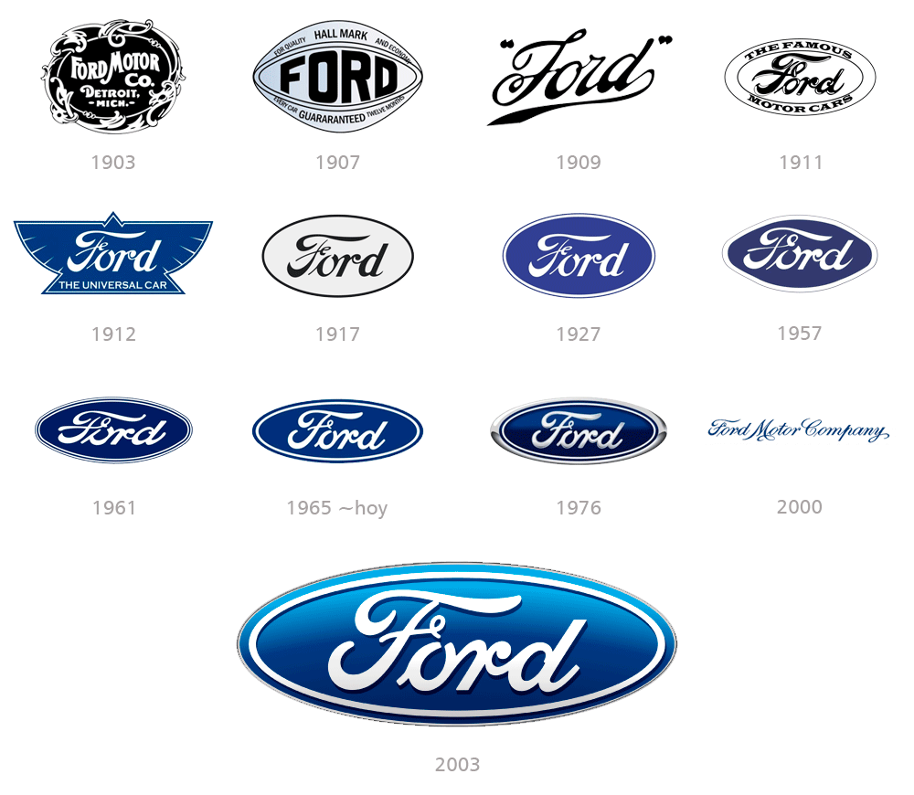
In 1903, the first Ford Motor Company logo was created and consisted of an ornate, rounded badge in a frame with leaves and curves.

In 1907, Ford decided to change its style to a modern and strong one, with a completely new style and shape: the diamond with soft rounded angles has a black "Ford" inscription in the middle.

In 1911 the company redesigned its logo with the founder's signature enclosed in a double horizontal oval, and the inscription "The Famous Automobiles"

This design begins to hint at the definitive features and its oval design that remain to this day.

The 1965 design is a narrow, horizontally stretched oval in a soft blue color palette, with a simplified double outline in blue and white.

This version is still used in most vehicles and has become the three-dimensional model used for certain applications.

Restyling logo Ford
ford publicidad

Gatorade

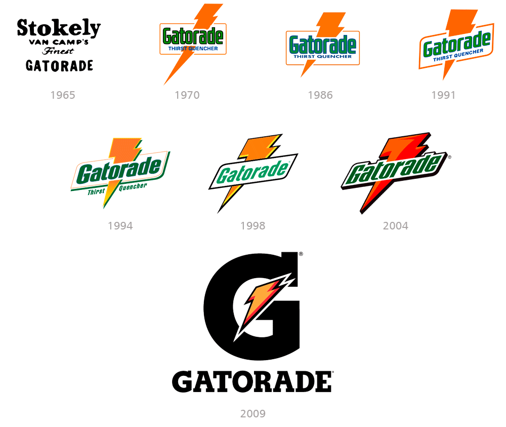
The original Gatorade logo was introduced in 1966 and features monochrome lettering on four levels.

It was more of an official badge than a label, strict and simple.

The 1970 rebranding brought an iconic, colorful symbol to Gatorade's visual identity.

The logo consists of a green wordmark with a black outline, enclosed in an orange rectangular frame, with an orange light beam passing through it.

It also has a blue slogan"Thirst Quencher" placed below the branding inside the frame.

Since the 1970 redesign, the Gatorade logo hasn't changed much, and the lightning bolt, a distinctive feature of the logo, has always been retained.

In 2009, a completely new concept was introduced with a responsive logo.

The wordmark is optional and is replaced by a large "G" that is now the main element of the visual identity.

This initial is crossed by a ray of orange light with a double red and black outline.

It has no additional details or gradient tones, just a smooth, flat logo composed of two symbols.

Restyling logo Gatorade
gatorade publicidad

Google

Google is the world's most popular search engine with the widest range of languages.

It was created by Sergey Brin and Larry Page, students at Stanford University.

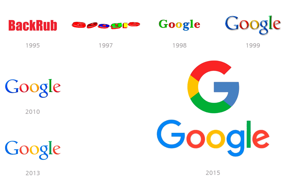
The prototype of today's Google symbol appeared in 1997.

Since then, it has undergone some tweaks and modifications, but the concept has remained the same.

In 1998 the logo acquired its current color palette using blue, red, yellow and green.

Google's iconic color palette, composed of four hues, represents the four main elements: air, earth, fire, and water.

It also represents the variety of Google services and shows its endless possibilities.

The colors red, blue, yellow, and green are used for all of the company's service marks, showing unity and connection.

The Google logo is subject to Google Doodles, which are temporary modifications that appear on the platform's homepage during holidays or to celebrate important events and/or historic achievements.

In 2015, the Google logo was redesigned again, leaving the characteristic color scheme intact but changing the style and shape of the letters.

Restyling logo Google
google publicidad

Heineken

Heineken is one of the most popular beer brands in the world.

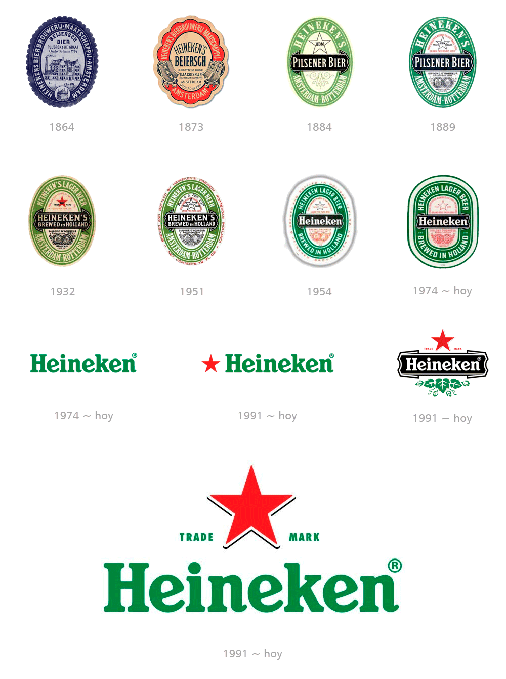
The initial logo from 1864 was a blue oval as a badge.

The gray space in the middle contains a drawing of the brewery itself, along with a few words explaining exactly what product they make.

In 1884, the oldest known logo for the beer was designed in an oval shape with a thick green frame on a white outline.

The central part of the emblem contains a black horizontal band with a wordmark, the black outline of a five-pointed star, and a thin green ornament below the band.

From that year on, green became the brand's institutional color.

The most recognizable symbol used in the Heineken logo is the red star.

In those days, brewing beer was considered an extraordinary and magical process.

The five-pointed star symbolized the four elements and the 5th magical element that determined the quality of the beer.

In the 1954 redesign, the label finally began using only the white "Heineken" lettering, set within a black horizontal ribbon bar.

In 1974, the main wordmark was introduced with the name in green and the typography that remains to this day.

In 1991, the second official logo was designed with an elegant and instantly recognizable green script with a solid red star, positioned to the left or above the lettering.

Sometimes the brand uses only the star, in other cases, the white wordmark on a black ribbon, with the red star above and a green leaf ornament below.

Restyling logo Heineken
heineken publicidad

Iberia

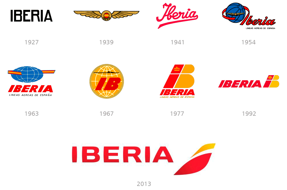
The original 1927 design is the most minimalist, with only the capitalized word "Iberia" represented.

In 1939 it was replaced by a winged logo and incorporated colors of the Spanish flag.

It later evolved into a wordmark in 1941, followed by elaborations on the balloon theme in 1954, 1963 and 1967.

In 1977, the era of the stylized design of the "IB" isotype began.

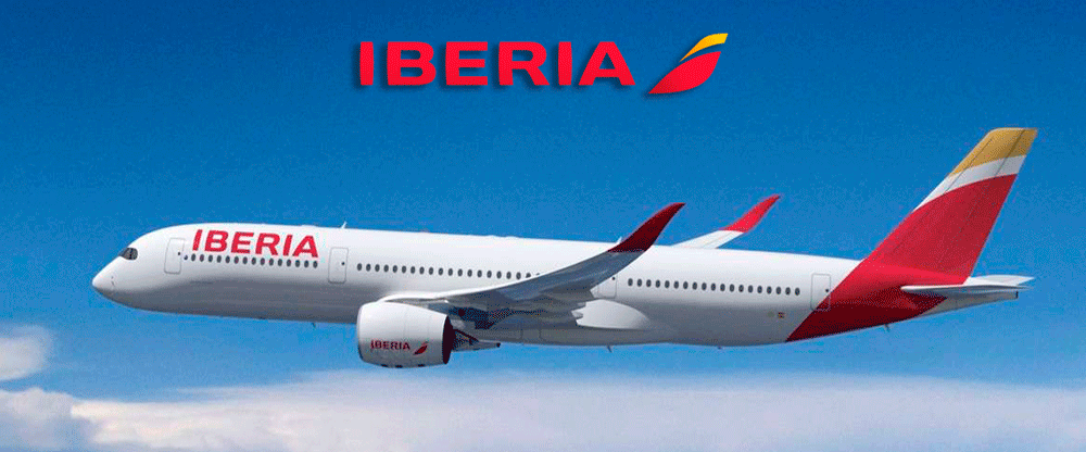
The abstract shape of the current logo, introduced in 2013, indirectly references the "IB" but this time focuses on representing the tail of the plane.

It has an incredibly modern, dynamic, and memorable style and places the company in a prominent place in the airline market.

Restyling logo Iberia
iberia publicidad

IBM

IBM is a world leader in software and hardware production, as well as providing a variety of support and consulting services.

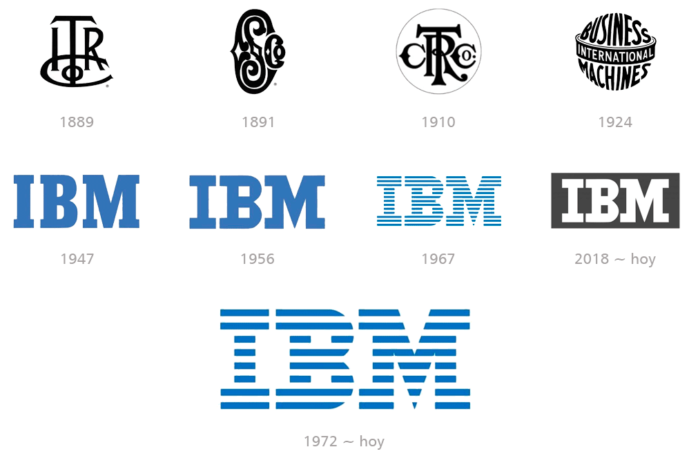
The company is established as a result of the merger of two businesses: International Time Recording Company and Computing Scale Company.

In 1924, the company changed its name to International Business Machines and the new logo was stylized as a globe.

In 1947, International Business Machines simplified its name under the acronym IBM, with a minimalist blue logo with capital letters executed in a massive, square serif typeface.

This design will be the pillar for future restylings of the brand.

The first version of the iconic striped IBM logo was designed in 1967 by modifying the previous emblem, where the blue inscription is cut horizontally into 13 equal strips.

In 1972 Paul Rand carried out the redesign that lasts to this day, reducing the number of lines to eight.

In 2018, the company decided to return to its original full logo from 1956, but now it is a white "IBM" inscription, placed on a dark gray background, and is used in minimalist occasions that require better legibility.

Restyling logo IBM
ibm publicidad

Instagram

Instagram is one of the most popular social networks, with more than a billion users worldwide.

Throughout its short history, the company has redesigned its logo on a few occasions.

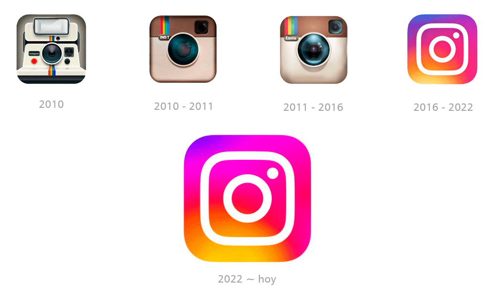
All based on the shape of an instant camera, versions of the Instagram logo have reflected the network's key designation: photo sharing.

In 2016, Instagram unveiled its new logo along with an updated app interface.

While many users criticized the design, it has remained unchanged for years.

The new version's sleek, minimalist design is based on the previous badges, but redrawn in an abstract, flat form.

The orange to pink gradient square with rounded corners has a bold camera outline drawn over it in white.

The 2022 redesign features a refreshed version of the 2016 logo, refining its color palette while maintaining the same concept and shapes.

The new logo also runs in orange to purple gradients, but all shades have been made lighter, so the icon now looks even brighter.

Restyling logo Instagram
instagram publicidad

Jaguar

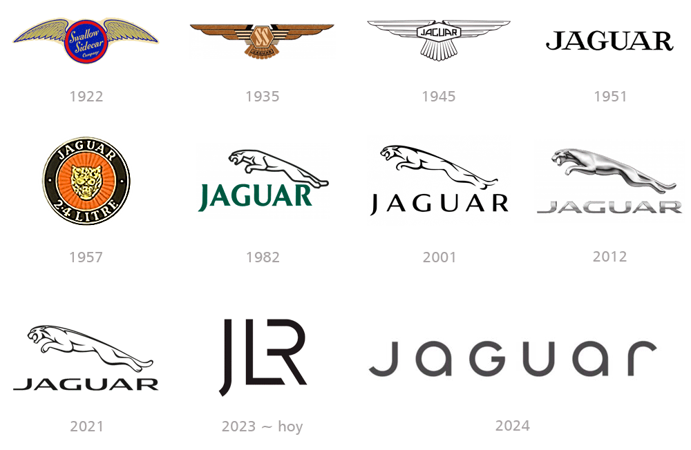
The luxury brand Jaguar, founded in 1922 in the United Kingdom, is famous for designing and manufacturing high-end automobiles.

The first versions of the Swallow Sidecar company logos were winged emblems and used the SS monogram, but later took on negative connotations due to its similarity to Nazism.

The 1951 redesign completely simplified the Jaguar badge, turning it into just an all-caps logo.

The black lettering is executed in an elegant full-form font with thick lines of the letters and thin, elongated serifs at their ends.

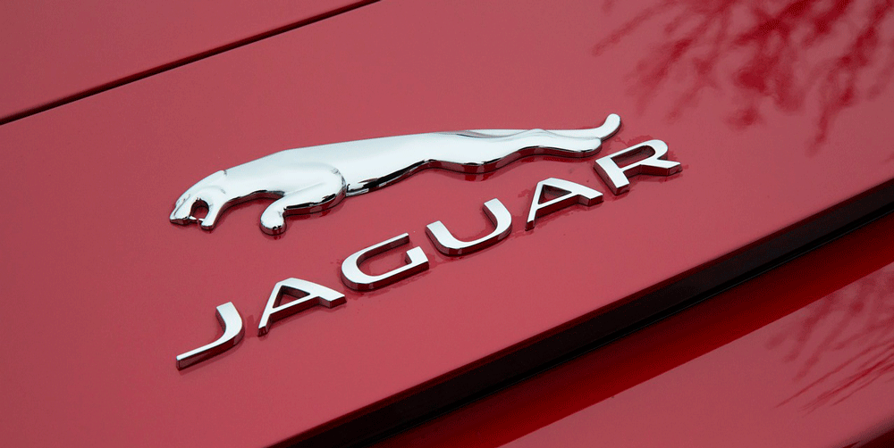
In 1957, a notable restyling took place and the image of the big cat that would identify the brand to the present began to appear.

The leaping jaguar logo was introduced in 1982, and that concept has been stylized to the present, giving the brand a true identity.

In 2024, the company will undergo a complete redesign of its logo, which has been highly controversial, as many believe its essence and identity have been lost.

These are the risks involved in trying to boast about being modern and cutting-edge by making radical changes and trying to impose the company's vision over customer preferences.

It only remains to wait and see what time brings in the assimilation and acceptance of such drastic changes.

Restyling logo Jaguar
juaguar publicidad

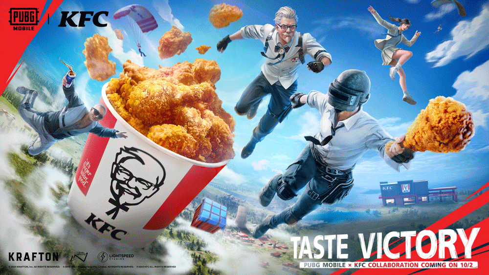
KFC

The fast-food restaurant chain KFC, which specializes in fried chicken, has more than 20,000 restaurants worldwide.

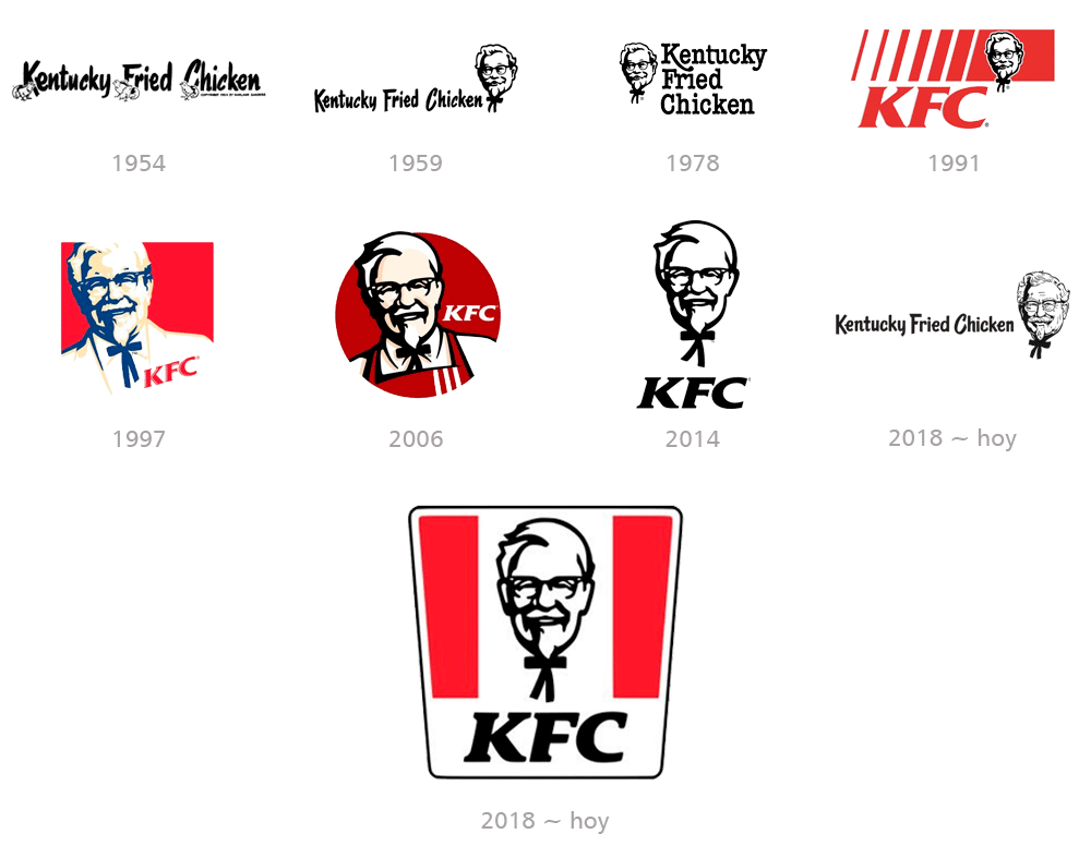
The KFC logo has always followed the same principles: color palette and the portrait of its founder.

The logo has been redesigned five times throughout its history, but this is definitely not a change, but rather an evolution.

The original KFC logo was designed in 1954 and features the “Kentucky Fried Chicken” wordmark in a handwritten font.

In 1991, it changed its name to KFC, its design changed drastically, and the color red appeared in the visual identity.

In 2018, the final redesign was carried out, changing the shape to a trapezoidal one and perfecting the portrait.

The KFC logo is bright and welcoming, a perfect choice for the fast food industry, evoking a sense of warmth and hospitality.

Restyling logo KFC
kfc publicidad

Kodak

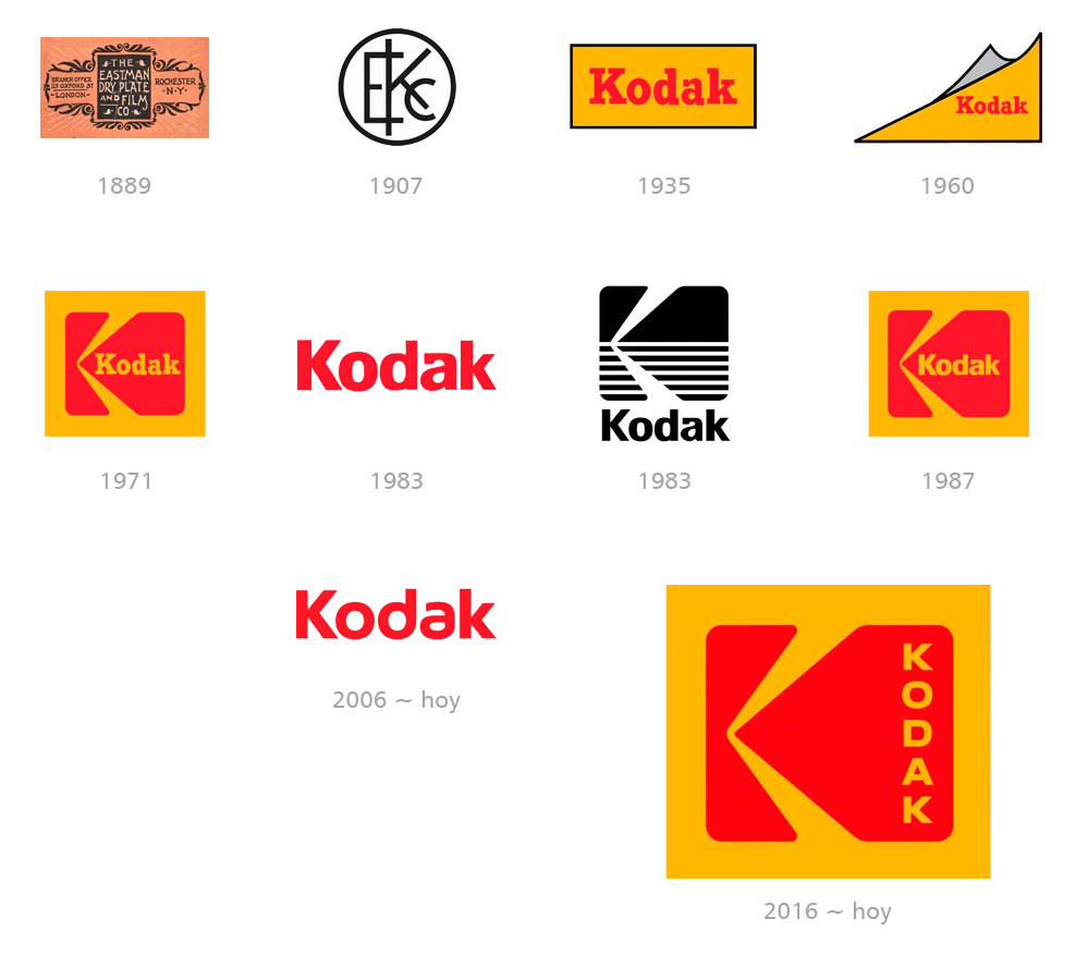
The initial logo was created for The Eastman Dry Plate Company in 1889 and featured an elegant artistic design style badge with a black frame adorned with white lettering.

In 1907 the company was renamed Eastman Kodak Company and changed its logo to a monogram where the three letters are executed in straight lines with geometric cuts.

In 1935, the name Kodak became official and the visual identity was redesigned.

The new emblem remains with the brand for many years and becomes the basis for the current badge that everyone knows.

In 1971, the predecessor of the current Kodak logo was created.

The new emblem features a solid yellow square with an enlarged red "K" stylized as a camera positioned in profile and a yellow "Kodak" script on its right side.

In 1983, the company went minimalist and made the simple red wordmark its official logo.

That same year, the brand adopted a very different logo, using a black and white color palette that replaced the traditional red and orange colors.

The lower half of the emblem has a striped pattern that adds dynamism and interest.

In 1987, the traditional color palette was returned to in more stylized versions of the 1971 logos.

In the following years, word mark versions alternate with isologotypes.

Restyling logo Kodak
kodak publicidad

Lay’s

Lay's is an American snack brand established in 1932 and is now one of the most famous potato chip manufacturers in the world.

The first Lay's logo was created in 1932 and remains the basis for the brand's current visual identity design.

In 1997, the logo incorporated the color yellow, which was drawn unevenly, evoking the shape of a sun and also a potato chip.

The characters are refined into more traditional lines and have a blue shadow.

The red background is now replaced by a ribbon, drawn around the yellow sun.

It is the first version of the logo that we all know today.

In 2007, the logo took on a three-dimensional form, maintaining the iconic color and composition of shapes.

The 2019 redesign returns to being flat.

The logo executed in intense yellow and red still has some gradient tones, but they add more movement and dynamics than volume to the image.

Restyling logo Lay's
lays publicidad

Levi’s

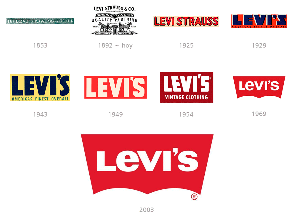
The Levi's story begins in 1853, but just 20 years later, the company introduced the legendary blue jeans and a patented way of securing clothing with rivets.

Its most iconic logo was created in 1892 and is still used today.

It features two men with horses pulling a pair of jeans in opposite directions, demonstrating the brand's strength and durability.

The interesting thing about this is that the illustration was added below the letters for better recognition, since many people across the United States, especially in the Old West, could not read English.

The badge we all know today was introduced in 1969 with a geometric red background with white lettering.

Its characteristic shape is somewhat similar to the wings of a bat, and represents the perfect fit of tight-fitting jeans.

Restyling logo Levi's
levi's publicidad

Logitech

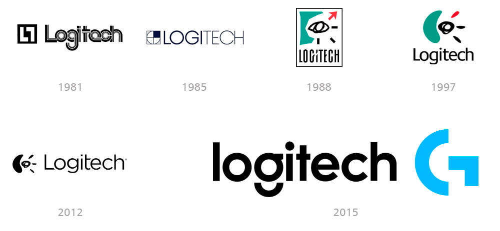
Logitech is an international manufacturer of computer software and accessories established in Switzerland in 1981.

The first Logitech logo is composed of a geometric emblem and a wordmark with thick, rounded letters overlapping each other, with thin white lines.

The 1985 redesign changed the logo, making it more modern and elegant.

Logitech's most iconic emblem was introduced in 1988.

The image, inspired by abstractionist artists such as Joan Miró, features a hand-drawn black eye with a modern, eye-catching color palette.

The 1997 redesign has softer, more simplified contours, but maintains the same artistic style.

In 2015, the iconic graphic part of the identity was eliminated, making its logo the main element.

The black wordmark is executed in bold sans-serif typeface with the letter "G" divided into two parts, representing a smile.

Sometimes the logo is accompanied by a stylized abstract letter “G” in light blue, which consists of a vertically placed arch and an angular figure.

Restyling logo Logitech
logitech publicidad

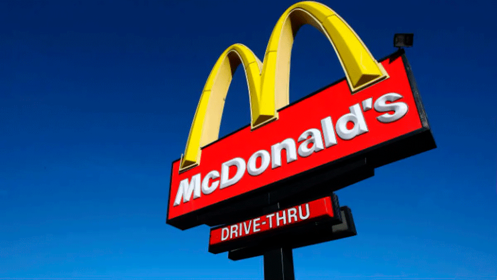
McDonald’s

McDonald's is not just a fast-food chain, but a truly legendary brand, representing an entire generation.

Its logo, featuring an arched gold “M” on a bright red background, is one of the most recognizable logos in marketing history.

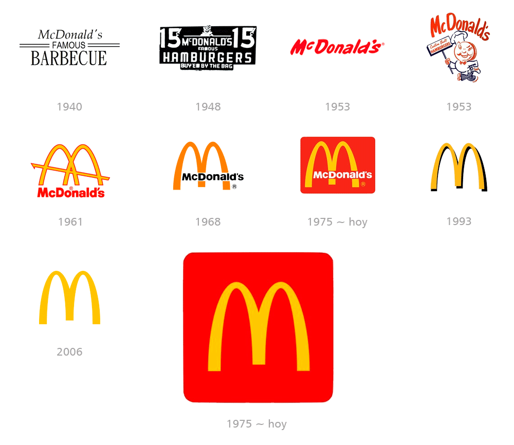
The company was founded in 1940 under the name "McDonald's Famous Barbecue".

In 1953 the company finally changed its name to simply McDonald’s and this is where it all begins.

The logo is still far from what we all know today, but the color red appears in the color palette, giving the right direction for the brand.

In 1961 Stanley Meston created the emblem that everyone knows today.

The iconic Golden Arches logo was inspired by the architecture of the company's first restaurants, specifically their rooftops.

That's why there is a diagonal line running through the arches in the first version of the logo.

The logo was simplified in 1968 by removing the diagonal line and shortening the inner ends of the arches, making them look more like the letter “M”.

In 1975, the emblem with the wordmark was placed inside a red rectangle with rounded corners and white lettering.

This logo is probably the most recognizable version of all fast food company logos.

The company still uses it, being instantly recognizable around the world and evoking a sense of joy, happiness, and passion.

Restyling logo Mc Donald's
logitech publicidad

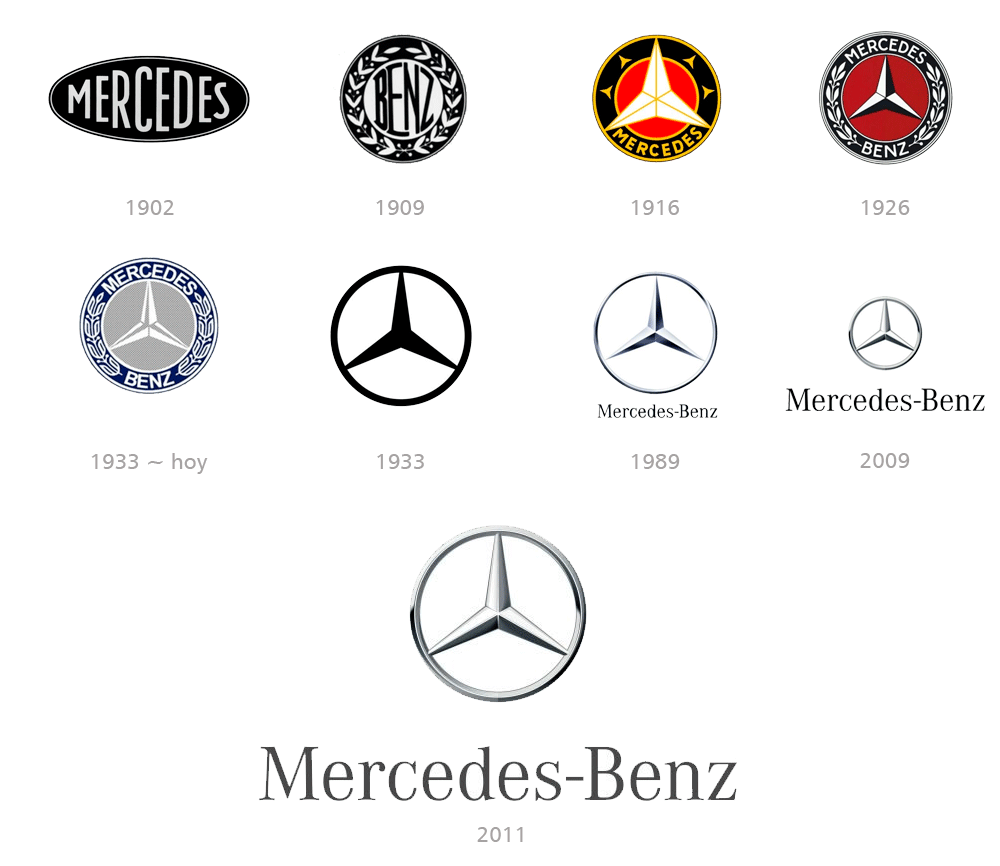
Mercedes Benz

There is hardly any car badge, which is more recognizable than the Mercedes-Benz emblem.

The three-pointed Mercedes-Benz star in a circular frame was adopted as the company's main emblem in 1916.

Since then, it has only slightly refined its contours.

The emblem was designed by the brand's owners, Adolf and Paul Daimler, who were inspired by a postcard image they received from their father, Gottlieb Daimler, in the early 1870s.

This emblem has a meaning for the company: to motorize the entire world on land, water, and air. Three directions, three points, three goals.

Restyling logo Mercedes Benz
mercedes benz publicidad

Microsoft

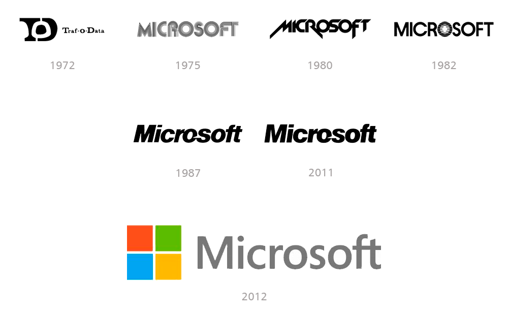
Microsoft was founded in 1972 and is the largest computer software and peripherals company, under the name Traf-O-Data.

In 1975 the company was renamed Microsoft and the first official logo was designed by Simon Daniels.

This is a monochrome logo where all capital letters are made up of numerous thin black and white lines.

In 1980, Simon Daniels himself redesigned the Microsoft logo again, changing the font to a sharper, more modern one.

The iconic Microsoft logo that almost all of us remember was designed by Scott Baker in 1987 and remains almost unchanged for 24 years.

The wordmark has a unique element: a white triangular cutout in the letter “O,” which aims to separate “Micro” from “Soft” and make people look at the company name from a new angle.

In 2012, Microsoft began a major rebranding of its corporate visual identity.

The new logo is designed by Jason Wells and features a geometric icon, where four small colorful squares form a larger one, reminiscent of Windows.

Restyling logo Microsoft
microsoft publicidad

Mirinda

Mirinda is the name of one of PepsiCo's best-known soft drinks.

The brand was founded in Spain in 1959 and was a great representation of the local orange industry.

After Mirinda was acquired by Pepsi, it gained worldwide popularity and is now available in several flavors.

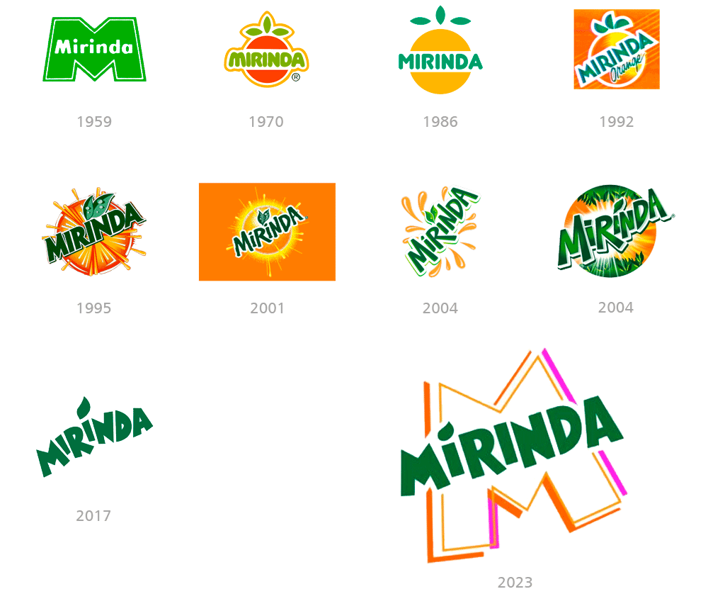
The first Mirinda logo was created in 1959 and remained with the brand for over ten years.

A bright green emblem depicting a stylized massive letter “M” in double green and white outline contains the denomination in white.

Starting in 1970, the brand sought to demonstrate the concept of the orange in its logo and the direct relationship with the fruit, undergoing multiple redesigns over the following years.

In 2017, Mirinda's visual identity features only a stylized green logo on a white background, which can be changed to orange as needed.

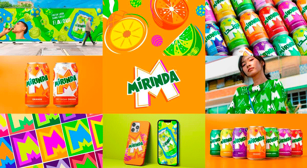
In 2023, the company introduces a fun update in the form of a colorful initial in the background, reminiscent of its first logo.

Restyling logo Mirinda
mirinda publicidad

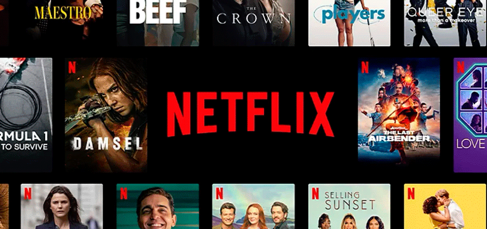
Netflix

Netflix is one of the most popular streaming services in the world.

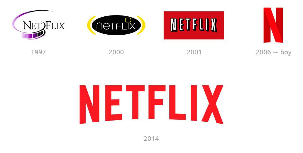
The first Netflix logo, created in 1997, features the website's name with a film strip separating the characters "T" and "F."

In 2000, Netflix introduced a new version of the logo, which only remained with the company for a few months.

Starting in 2001, it adopted the design and color palette that has remained the same to this day, with only a few very subtle changes.

In 2016, Netflix introduced a new logo consisting of a solitary "N."

It's not a replacement for the current brand, but rather a smaller alternative as an avatar for mobile apps and social media.

Restyling logo Netflix
netflix publicidad

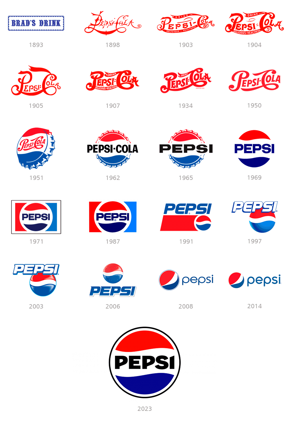
Pepsi

The 2023 design draws on Pepsi's 125-year history, striking a balance between classic and contemporary.

Community participation was considered, with many drawing the logo with the name inside the balloon, which led Pepsi to bring back this feature.

The goal was to create an image that was recognizable, timeless, and would connect with new generations, preparing them for the future.

The new design merges the Pepsi globe and wordmark, incorporating electric blue and black for added contrast and dynamism.

A new custom typeface has been created, repositioning the brand name within the globe, evoking classic versions of the logo.

This one maintains its classic red, white, and blue stripes, but with a slight change in its appearance reminiscent of its 90s image.

Pepsi
pepsi publicidad

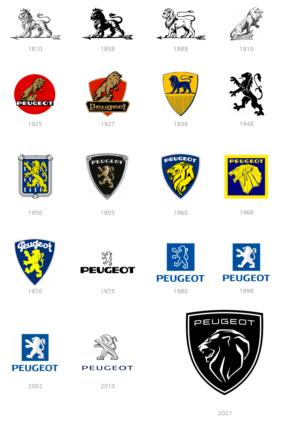
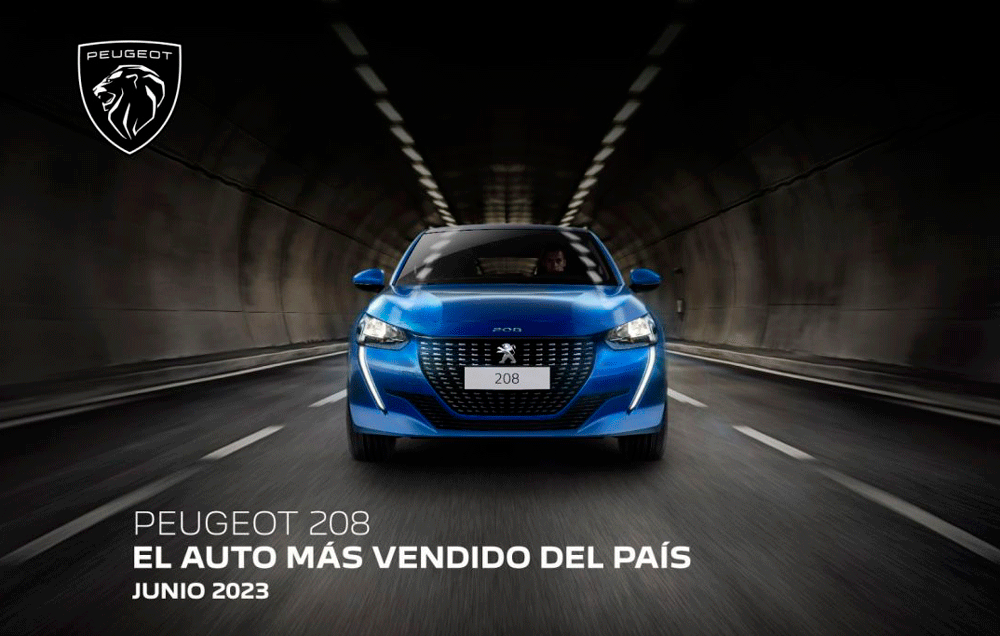
Peugeot

Peugeot is a French brand of automobile manufacturers, founded in 1810 by Emile Peugeot.

The Peugeot logo dates back to 1847, making it the oldest automobile emblem in the world.

The idea of the lion as a brand symbol was born in the mid-19th century, when the Peugeot family's steel company needed a logo that reflected the company's activity and strength.

The Peugeot logo has undergone numerous changes throughout its history, but the lion has always been there.

It was not until 1927 that the Peugeot brand name appeared for the first time, and the lion design became more stylized and took on the form of a shield.

In 1948, the image of the rampant lion showing its claws in an attack position emerged.

It is designed in solid black and could be placed on any background.

In 1960 the brand drastically changed its image with a more three-dimensional image of a lion's head with a thick mane.

The year 1975 marks the birth of the famous "Lion Outline" logo. The Rampant Lion is back, but now it looks futuristic.

In 2010, it was redesigned with a 3D effect that is enhanced by the metallic color palette.

The visual identity changes completely again in 2021.

The new logo features a sleek black shield with a double white outline and a stylized portrait of the lion, reminiscent of the 1960s design.

Restyling logo Peugeot
peugeot publicidad

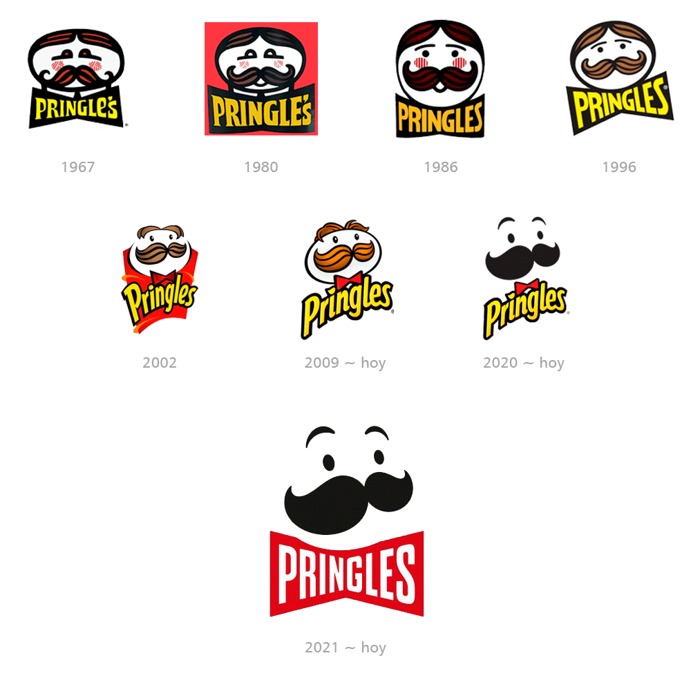
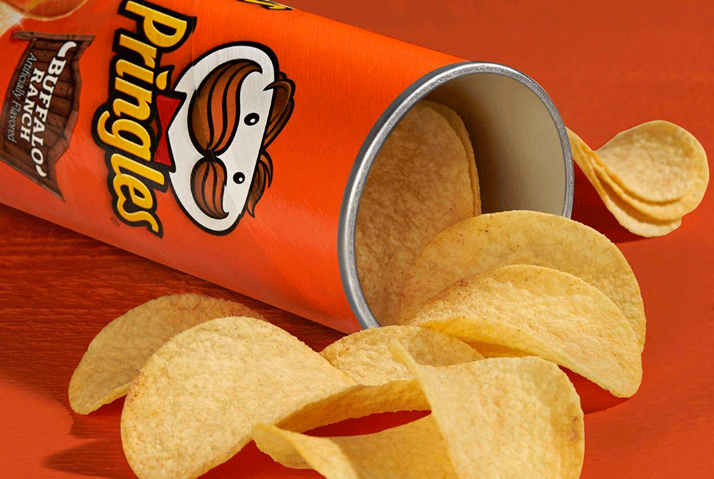
Pringles

Pringles is the name of a food brand that was established in the United States in 1968 and is known for its potato chips in cylindrical containers.

The Pringles logo has undergone several modifications, but has always featured the Mr. Pringle mascot and the product name.

The original 1967 branding features a portrait of a rounded man executed in bold black lines with red and black striped hair.

The yellow lettering of "Pringle's" is placed below the portrait in an enlarged solid black bow.

In 1986 the brand name changed to "Pringles" and the logo was redesigned.

The portrait changes its shape to a circle and the lines of the face are redesigned in a more modern and playful way.

In 2002 the brand introduced a more elegant and ornate logo and the bow became smaller in gradient red, with its thick black outline.

The man with the mustache is redesigned in a more contemporary way on a red background.

The current logo was created in 2009 and is based on the previous version, but the background is removed and the typography is changed.

In 2022, a simplified version was created for use outside the United States, with the name written in white inside a red bow tie below the face.

Restyling logo Pringles
pringles publicidad

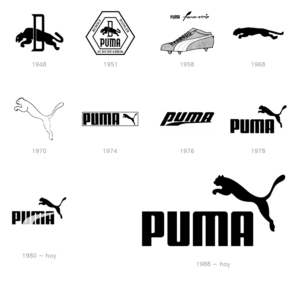
Puma

Puma is one of the oldest companies in the world of sports, and its logo is one of the most recognizable emblems in the history of sports brands.

The company was born from a simple family dispute between brothers, which resulted in the formation of not one, but two legendary brands: Puma and Adidas.

One of the brothers named his company Addas (later renamed Adidas) and the second, RuDa, which later changed its name to Puma.

The puma has appeared in the brand's logo since the company's inception.

The jumping animal is a representation of movement, power, freedom, and speed, qualities that are strongly connected to sport.

An emblem is created in the form of a soft and elegant strip, a curved line, which narrowed towards the top.

To this day, the company uses this minimalist emblem on its clothing, as a symbol on most of its sneakers.

The puma began to be positioned more vertically in 1970, and thus the royal predecessor to today's iconic badge was born.

The shape strip replaced the cat again in 1976, positioning itself below the lowercase logo, with the vertical stroke of the "P" elongated.

The logo's letters were capitalized again in 1978, and the leaping puma returned to the upper right corner of the wordmark.

Restyling logo Puma
puma publicidad

Windows

Windows is the name of a computer operating system developed by Microsoft and undoubtedly the most popular in the world.

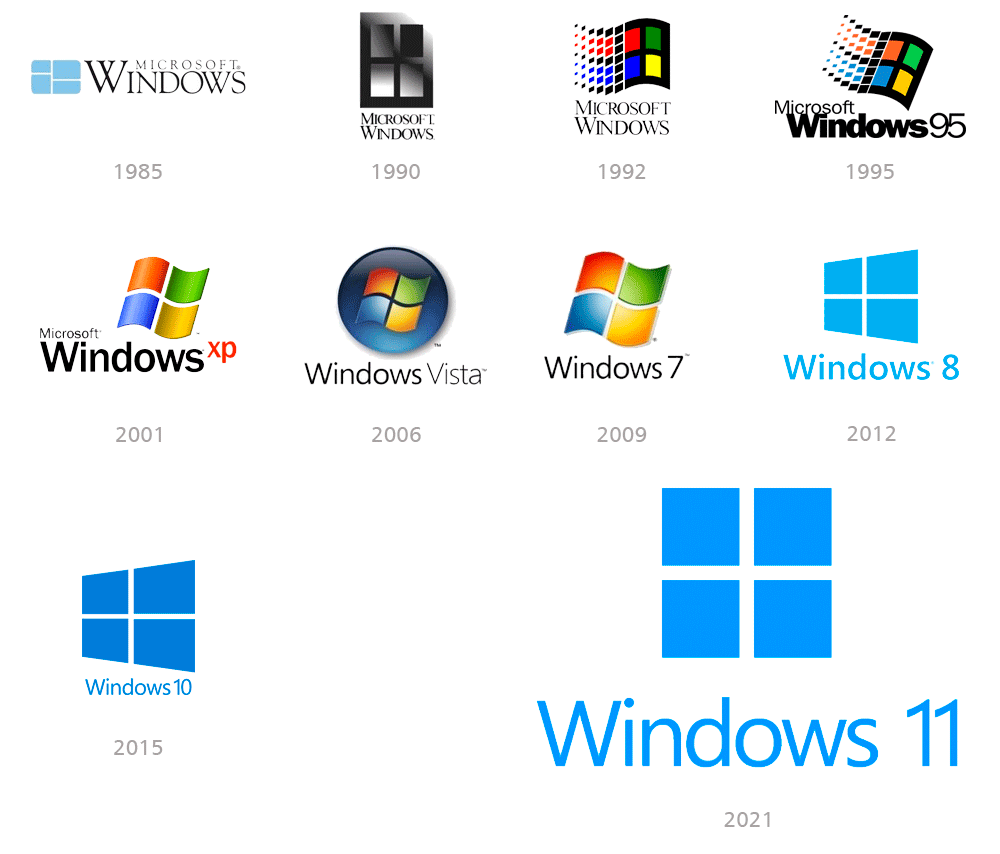
Since its launch and creation of its first logo in 1985, there have been more than 15 versions designed to date.

They all have one thing in common: the image of a window, which was not always so legible, as in some designs it resembles a flag.

The era of the Windows Flag logo begins in 1992 and lasts until the 2010s.

The first colorful badge was designed in 1992 and had a waving flag shape that dropped into pixels on its left side.

In 1995, a new concept was born in the Windows operating system that was truly revolutionary and changed the way we communicate with the computer.

The logo also features a notable redesign, with the flag now positioned diagonally to the left of the nameplate, which has now been enlarged.

The typography changes to bold sans-serif "Windows", which is now the main part of the logo.

In 2001, the black frame was removed from the flag, so the emblem now consists of only four waving squares with a three-dimensional appearance.

In 2006, the emblem acquired a flatter, more modern design. It still features gradient colors, but the square texture is no longer three-dimensional.

The word "Microsoft" is removed from the logo, and "Windows" takes on its own identity, making it look more minimalist and professional.

A new era of visual identity design begins for Windows in 2012, representing the most notable change of this century, coinciding with the launch of Windows 8.

With the Windows 8 operating system, the design of the operating system's graphical interface also changes significantly.

This is evident in the logo design created by Wolff Olins. which uses only the color blue, the waveform is gone, and the emblem is strict and geometric.

Restyling logo Windows
windows publicidad

Fashions, trends and functionality

By looking at 40 brands together rather than individually, we can perceive certain patterns that are repeated at certain times and at the same time.

This has to do with the fashions and trends of each era that force brands to adapt and compete with each other.

Throughout their history, there are brands that have returned to the original concepts of branding.

We can see this in the design of their brands, reminiscent of the past, but this time more stylized and in keeping with the times.

Some brands have changed their styles, fonts, concepts, and colors, allowing them to evolve and become what they are today.

If you want to know more about color in branding, I recommend reading my article How to apply color psychology in logo design, where you will see several of the logos mentioned in this article and many more.


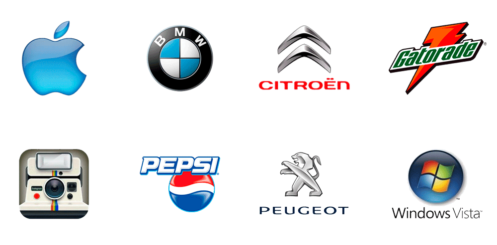
Three-dimensionality

Towards the beginning of the 2000s, with the arrival of new operating systems, we can notice that many logos acquired three-dimensional aspects.

These were initially popularized for their ability to stand out, generate visual impact, and convey a sense of innovation and modernity.

With new 3D design technologies, brands are beginning to acquire volume and textures through lighting and shadows, simulating various real-life materials.

The new trend of creating animated logos for advertising and multimedia applications was also favored by 3D design.

With the advent of mobile devices and touch screens, three-dimensionality adds depth and realism.

A raised design makes the logo “pop” off the page or screen, capturing the viewer’s attention more effectively.

As we move from analog to digital, people no longer need buttons on keyboards, but they do need to identify them on screens.

The mouse's tip is now the tip of our index finger, making it necessary to highlight buttons and clickable areas on small screens.

In a sea of two-dimensional logos, 3D offers a unique way to stand out and create a memorable visual identity.

Sectors such as technology, video games, and fashion, where innovation and image are crucial, are the first to adopt three-dimensional logos.

logos 3d

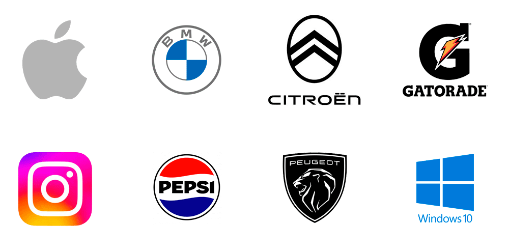
Return to simplicity

Everything changed when Apple announced iOS 7 in 2013 and quickly imposed a return to flat, minimalist images.

The rise of mobile devices forces web design to adopt responsive development that adapts to various screen sizes, even very small ones like a smartwatch.

That's why we see the opposite process, with increasingly minimalist and flat logos.

The need to identify brands on social media and websites brings the same responsive approach to logo design as web design.

"Avatars" and "favicons" are born, which are highly simplified icons of logos for profiles on social networks and websites.

I suggest you read my article What is a responsive logo to understand this topic.

At the same time, we find a trend toward monochromaticism that favors the simplicity of logos and their printed application on any surface and digital media.

logos 2d

Final conclusion

I hope you enjoyed this article and understood the importance of brand redesign to keep your brand identity current over time.

We've learned stories and how brands have evolved and adapted to the trends of each era, new technologies, and new applications.

Some brands have managed to maintain their features almost unchanged, while others have made frequent and very significant changes.

There are brands that have even changed their name, colors, and personality, undergoing a complete rebranding.

It's all a matter of knowing how to adapt and evolve as the market needs.

The graphic designer is always a key professional in the development of a company's visual identity.


If you've been wanting to start your own brand and think I'm the perfect person to develop it, don't hesitate to contact me.

In the Related Articles section below, you will find some articles with specific topics that complement the one you just read.

I invite you to read them, share them and leave your comments if you wish.
Thanks.

>>> I WANT MY LOGO <<<

Packaging posavasos

The most complete guide to understand logos

Let's talk about logos

This is the most complete guide to understanding logos.
Do you know what is the difference between logo, isotype, isologotype and imagotype?

In this post I intend, without lecturing on anything, to show you everything you need to know about logos.
You will know the different types classified according to their morphological and semantic structure, graphed with very famous logos that you probably already know.

If you are a graphic designer, this guide will help you to reinforce your knowledge and incorporate some aspects that you may not have known about.
If you are a client who is looking to design your brand, you will have a global idea of all the design possibilities that I can offer you, and choose the one that best suits your company, product or service.

I welcome you and hope you enjoy it.

>>> I WANT MY LOGO <<<

Packaging posavasos

What do we call a logo?

Not everything we call a logo is actually a logo.
It is a misconception to call any graphic image that identifies a brand a logo.
But it is also true that our clients surely do not know all the technical terminology that we use. graphic designers.
And when requesting a visual identity design service we would be complicating the task of finding us on the web.

That is why we usually use the word logo (or its shorthand for logo) in a generic way, and we all understand what we are referring to.
In order to favor the SEO positioning of our services in search engines, we accept the word logo to cover all possible variables.
Therefore, it is certain that very few will Google “image design” but rather “logo design”.

What a logo is?

The word logo comes from the Greek language, where "logos" means "word" and "typos" means "punch mark or imprint".
This is because the old printing systems stamped the characters by means of blows given with molds called types.

The visual image of a brand, product or project (which we usually call a logo), is a graphic symbol that identifies it, allowing it to be recognized among its peers.
Some brands are capable of transmitting a message, a concept or specific information about it. which represent.

Although it is not necessary that this image be allusive to the brand, it is considered a good "added value" that this symbol transmits some allegorical message.
This message can be oriented both to the name and to the activity they carry out, favoring the pregnancy in the public and its correct identification.


Read my article 80 logos famous with hidden messages where you will know some interesting curiosities about the design of many logos that you will surely already know.


Represent the synthesis of an idea

The Fate logo represents a tire. Fate manufactures tires and the chosen symbol is the synthesis of their activity reduced to the minimum expression: All tires are round.

The INCAA logo represents a film frame: All stages of the film production process are reduced to a cut frame.

The Instagram logo represents a camera. Instagram is a photography social network: All photographs are obtained by means of a camera.

Therefore, we summarize that a logo is not just any graphic drawing or pretty typography that identifies a brand.
Graphic designers often hate when our clients say to us very proud: "I send you the logo in Word" and it is their name written in any typeface and color, but that is another topic of discussion.

What do we need to consider before designing a brand?

Before undertaking the project to develop a visual identity we have to know our client very well and know what they want to communicate, and thus obtain the concept of the brand.
Subsequently, it is essential to know what type of product or service sells and how the brand will be applied.


Brand usability

It is not the same to design a logo for electronic devices than one for a clothing brand, where the brand will be applied embroidered on a small fabric label.
In these cases, we should not design logos with too many details or quantity of colors, since we will have many inconveniences when applying them on the products.

Some companies require to apply their marks in large canopies with corporeal letters, or on the contrary, in very small supports such as pins or pens.
A brand's design must also support video animation or 3D implementations.
That is why we have to take into account all these factors before choosing what type of brand we are going to develop.

Logos 3D

What are the different types of logos and how do we identify them?

The visual image of a trademark can be made up of one or more words and a symbol in various combinations.
Next, I am going to explain to you with very famous examples, all the types of logos classified by their morphological and conceptual structure:

1. Logotype

The logo or wordmak consists of a brand composed exclusively of words.
It is a mistake to consider any name to which a typeface and an institutional color is applied as a logo.
A brand should try to be unique and perfectly recognized .
Logos must have a projected design with a communication strategy.
The typographic style and the appropriate choice of institutional color must be taken into account, both determining factors to give a visual identity to the brand.
The logo color is not a determining factor of identity.
A good brand must be able to identify itself in black and white, positive and negative.

Logotipos

Variations allowed

Large companies generally create their own typefaces that add identity.
Others take popular commercial typefaces by adding subtle detail or applying some kind of warp to them.
Thus we can see the use of expansion, contraction, variation of the kerning, curvatures in its baseline, which provide traits of business identity.

Some brands incorporate very subtle geometric elements that are not considered as isotypes or pictograms, and for this reason they are clearly considered logos, and not images or isologotypes.
Any other graphic element that composes it (boxes, outlines, underlines) will be secondary and will not provide identity but only decoration or graphic reinforcement.

Logotipos con variaciones

Some logos have duplicate letters or special typographic characters (such as umlauts, dashes or accents), or simply variations in their letters (ligatures, rotations, mirrors).
These are very useful elements, since strategically designed they grant an additional semantic value to the brand.

Logotipos con signos

There are also marks in which some of their characters are replaced by a pictogram with similar shapes.
These fulfill the role of the letter they substitute, and in other cases, the symbol replaces a verbal or phonetic expression.

Logotipos con simbolos

Some designers use the negative value resource to omit characters without losing readability.

Logos con contraformas

Other designers choose to take a bolder step and create typographic alphabets with minimal legibility but with a great pictographic sense, reaching the limit between the concept of logo and isotype.

At first glance it is perceived as an abstract isotype but in reality it is a typographic logo.

Alfabetos especiales

2. Isotype

The word isotype comes from the initials of the English expression “International System of Typographic Picture Education (Isotype)”.

The purpose of this system was to achieve visual communication through purely visual, non-verbal elements.
The value of this type of proposal was quickly capitalized by the advertising world for the benefit of brand positioning in the market.
Therefore, the isotype or symbol of the brand is a graphic symbol (not typographic) that represents the visual essence of the brand.

It is the perceptible representation of an idea, with features associated with a socially accepted convention:
They have the peculiarity of being able to be applied independently (without the logo) without losing identity.


The power of giving identity

Sometimes the isotype is so strong that when you see it you immediately associate it with a brand without having to read its name.
Many isotypes are allegorical or tell a story related to the brand they represent.
Generally used in large international companies with long trajectories, whose products or services are deeply rooted in the people.
In these cases, the mere presence of the isotype indicates prestige, quality and institutional solidity, and that is why they generate in people the need to acquire them.

Isotypes can be pictographic or typographic symbols.


Pictographic symbols or pictograms

Pictogram is a neologism and has its etymological origin in the Latin "pictus" which means "painted" , and in the Greek "gramma" which means "written"

Pictograms are signs that, through a figure or a symbol, allow to develop the representation of something.
Many ancient alphabets were created around pictograms, such is the case with Egyptian hieroglyphs.
In prehistory, man recorded various events through pictograms.
The figures that appear in cave paintings, for example, can be considered as pictograms.

A pictogram is a sub-class of isotype and consists of a symbol in the form of an icon that represents the minimum synthesis of the objects, shapes or characteristics that best identify it.

Pictograms can be figurative or abstract.

Figurative pictograms

They have great graphic similarity with the real elements they represent and their design is very simple and minimalist.
They are easily recognized and accepted by consumers, and they create a very close identity relationship with the brand they represent.
That is why We mention them as Apple's apple, Twitter bird, Mercedes Benz star , etc.

Picotgramas figurativos

Abstract pictograms

Unlike figurative pictograms. They are not directly related to elements of the real world, but rather represent a subjective concept or idea of the brand.

Picotgramas abstractos

Pictograms on signage

The pictogram is not an exclusive concept of brand design.
They are also used in the design of signaling systems due to their ability to replace words or concepts with images or icons.
This is very necessary and favorable to break from this way the international language barriers.

These are universally accepted symbols, with an extremely simple and minimalist design.

These symbols have a direct semantic relationship with what they represent, so as not to leave your meaning behind.
That is why it is very common to see them in public spaces such as airports, restaurants, highways and shopping centers, as well as on electronic devices .

Pictogramas en señaletica

Pictograms in everyday life

Surely very few times you became aware of the role that pictograms fulfill in our daily lives.
Not only from the world of brands, but also in the environment in which we live.
We are able to identify a commercial brand through its pictogram without having to see the name (unspoken mode) and that is possible thanks to good graphic design and successful advertising campaigns.
Without realizing it, we are bombarded with signals and stimuli that finally make us recognize those symbols even if we don't consume them.

Almost everything that surrounds us has some kind of pictogram and graphic design, from the remote control of the television, the urban signs, to your mobile phone.
We live permanently interacting with pictograms without realizing it, and these greatly simplify our daily life.

That is why when someone tells you that graphic design is not important or that it is only a «decorative» discipline, ask them what they would do if they were in an airport in Dubai or Tokyo without the presence of those «cartoons» that they despise so much.

Pictogramas aplicados

Typographic symbols

They are made up of typography and the main characteristic of these symbols is that the characters form graphics, but not words, so it can be confused with a logo.
According to the number of characters that compose it, they are divided into: Initial, Monogram, Acronym, Acronym and Anagram.


Initial

The brand is represented only by the first letter of its name and can have an element that contains it (a square, a circle, etc.)

Logos con inicial

Monogram

The word monogram comes from the Greek "monos" which means "alone, unique, isolated" and "gramma" which means "engraved, written"

The monogram is a logo variable and is applied to brands that use two or three initials as an abbreviation, and can be used (or not) accompanied by a logo.
Generally they correspond to the first and last names of people or the initials of the words that make up the name of a company.
It is not simply individual letters.
They are graphically combined by means of a design, interlacing the features of some letters with others, to form a sign fused in a single unit to stamp mode.

Logos con Monograma
Logos con Monograma

Sigla

Etymologically it comes from the Latin «sigla» which means «figures and abbreviations».

It is a word formed by the set of initial letters of an expression.
Each letter corresponds to a word, is pronounced independently, and does not form a new word, as in the case of anagrams and acronyms.
It differs from monogram in that it is not intended to create a fused symbol, but rather that the letters differ well separately.
They are generally used in large multinational companies to summarize very long or difficult international pronunciation names.

Logos con siglas
Logos con siglas

Acronym

An acronym is a linguistic rather than a graphic concept.
Its etymology is of Greek origin formed by the words «akros» which means «extremes», and «nimo» which means «name»
Consequently, an acronym means "extreme name" or "name made up of extremes."

On the one hand, it is the term formed by the union of elements of two or more words: Mercosur (Mercado Común del Sur), FedEx (Federal Express), Banelco (Banca Electrónica Compartida), Wi-Fi (Wireless Fidelity), etc.
On the other hand, an acronym that is pronounced as a single word is also called an acronym: NATO, UFO, UN, AFIP.
It also refers to the word formed by the union of elements of two or more words, consisting of the beginning of the first and the end of the last.

A clear example is Pinterest , a social network that summarizes the idea of clicking with a "pin" on the board those contents that "interest" us, so that they are quickly accessible when we need them.

Large multinational companies take advantage of the use of acronyms to create short, strong brands that are easy to recognize and pronounce in different languages.

Logos acronimos
Logos acronimos

Anagram

It comes from the Latin «anagramma» and consists of creating a new word from the rearrangement of the letters that make up another word.
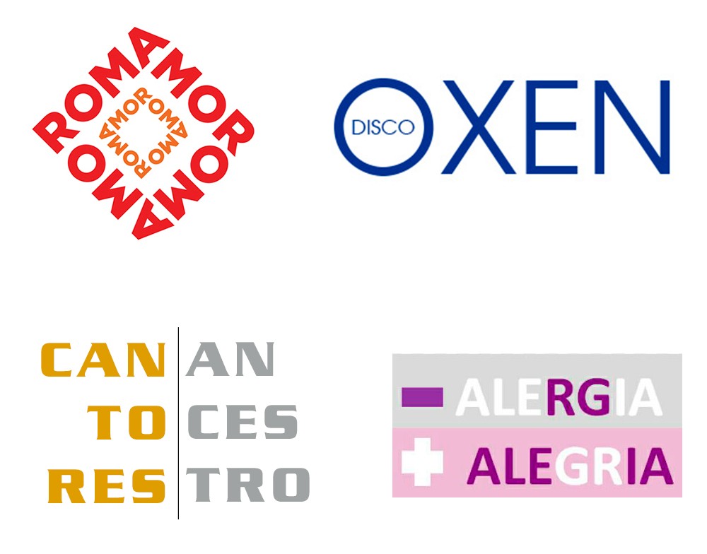
They are very common examples of anagram: LOVE, ROMA, ARMO, MORA, RAMO

Therefore, an anagram, like an acronym, is a linguistic rather than a graphic concept, allowing the creation of word games that add originality to the brand name.

In the following examples, OXEN is a by-product of the NEXO company and the set of letters indicates the membership relationship between the two.
CANTORES ANCESTROS (ANCESTRAL SINGERS) is a folkloric musical project with strong aboriginal roots, and its name represents its essence: Singers who perform their ancestral music.
- ALERGIA + ALEGRÍA (in spanish means "less allergy, more joy") in addition to playing with the paronyms, it incorporates the antonym: ALERGIA (ALLERGY) produces sadness, and it is the opposite of ALEGRIA (JOY).

Logos Anagramas

3. Isologotype

An isologotype or isologo is a type of combined brand, which consists of an isotype and a logo grouped in a single graphic symbol that cannot be separated, as an identity seal.

You have to be very careful when designing isologos.
Being words within symbols, graphics can have legibility problems in very small brand applications, less than 15 mm.
Such is the example of merchandising products printed matter: pens, pins, newspaper ads, etc.

Isologotipos
Isologotipos

4. Imagotype

The origin of the word imagotype comes from Latin "imago" which means "image" and « type » comes from the Greek « typos » which means « Blow, mark, shape ». Just as the etymological meaning of the logo is "brand-word" , the imagotype is "brand-image".

The imagotype is the most frequent type of combined brand, in which the isotype and the logo act together.
Unlike the isologotype, both elements can be recognized separately without losing identity, since they have a well-defined graphic presence .

Imagotipos
Imagotipos

5. Signature

It consists of creating a logo from the handwritten signature of a person.
It is generally applied to very famous personalities whose own name has become a registered trademark.
Such is the case of great fashion designers, musicians and movie and sports stars.

Logotipos con firmas

6. Mascot

They are logos whose design is based on a character or mascot, be it an animal, a person, a cartoon or an animated object.

The mascots work as an isotype that complements the logo.
This logo has sufficient graphic identity and does not depend on the mascot to survive, in fact it can be omitted and the brand will be easily recognized.
While the logo gives identity, the mascot directly communicates value and culture to customers, and reinforces the institutional image, since they often maintain the colors of the logo.


Why use a mascot logo?

The mascot is associated with good luck and reflects the spirit of the organizations with which it is linked.
They are very efficient in terms of associating the image with the brand they represent as they are very easy for the public to remember .
They have great communication potential in marketing campaigns, since they are very friendly and allow various advertising developments.
And this is how we see them in animations in audiovisual media, creation of merchandising products, corporeal applications for banners and exhibition stands.
They are even used in promotional live performances with dolls and actors, etc.

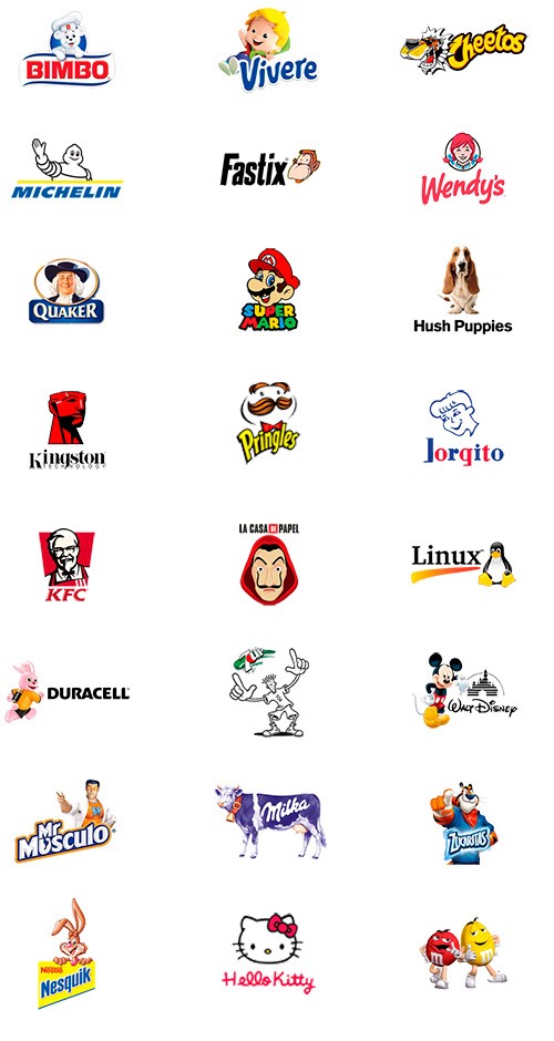
The mascot creates a bond of familiarity with its consumers and transmits a very clear message:

  • The Bimbo bread bear is soft, delicate, neat and fluffy.
  • Mr. Muscle is a superhero who with his powers will do the heavy cleaning work without you having to strain.
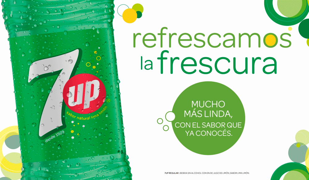
  • “Fido Dido” from 7up, is a simple character, colorless, adolescent, rebellious, carefree, with a lot of personality and he always does his own thing.
Mascot logo
Mascot Logos

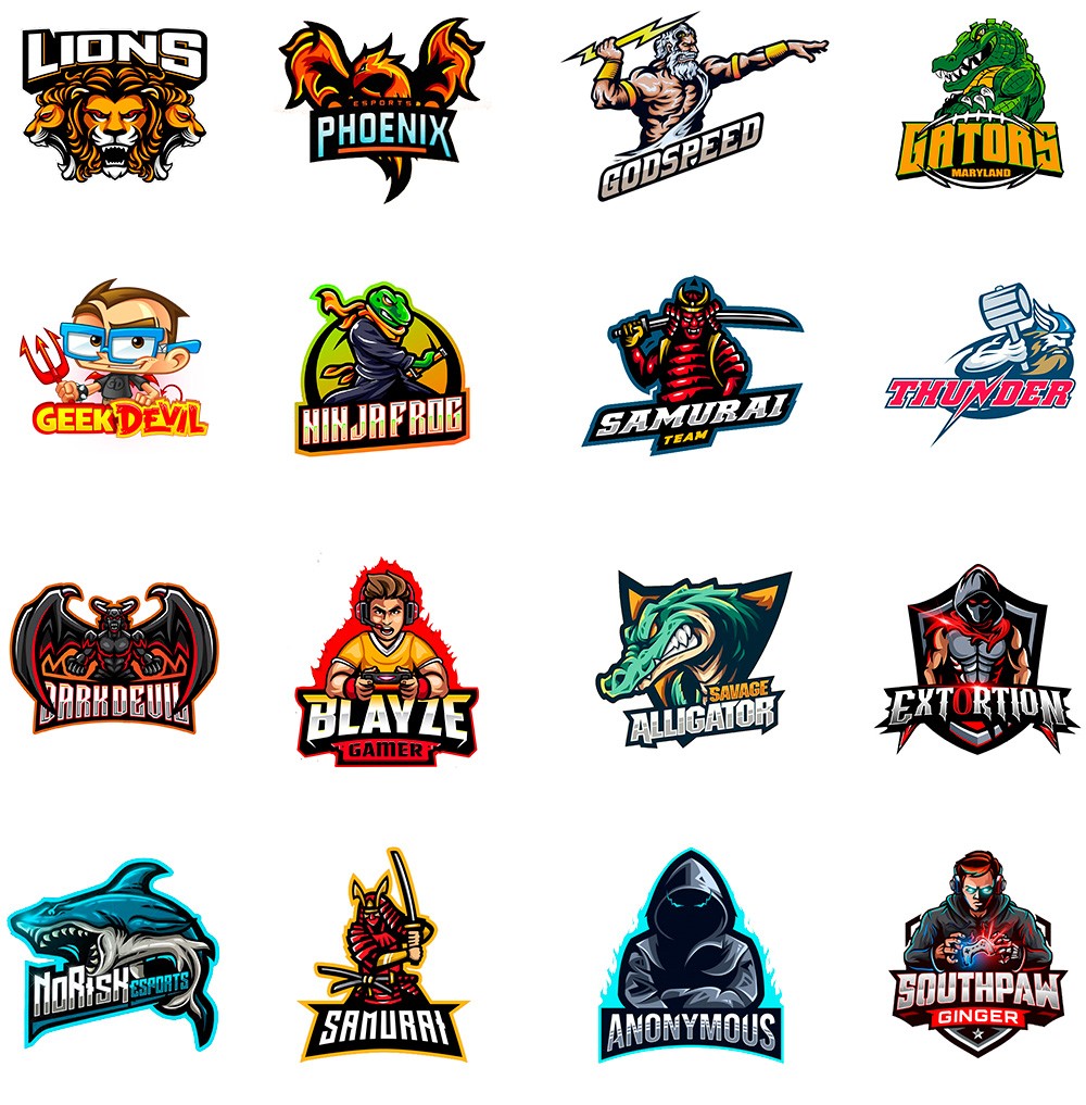
Gamers and Esports

Mascot Logos are currently a trend in the world of Gamers and Esports to identify sports teams.
The choice of mascot reflects the spirit and values of the brand they represent.

In these cases they have a very particular graphic design and their characters have aggressive attitudes and intense colors.
They represent action games with a lot of adrenaline, with opposing teams that seek to be the winner or the hero of the story.

Mascot Logos for Gamers

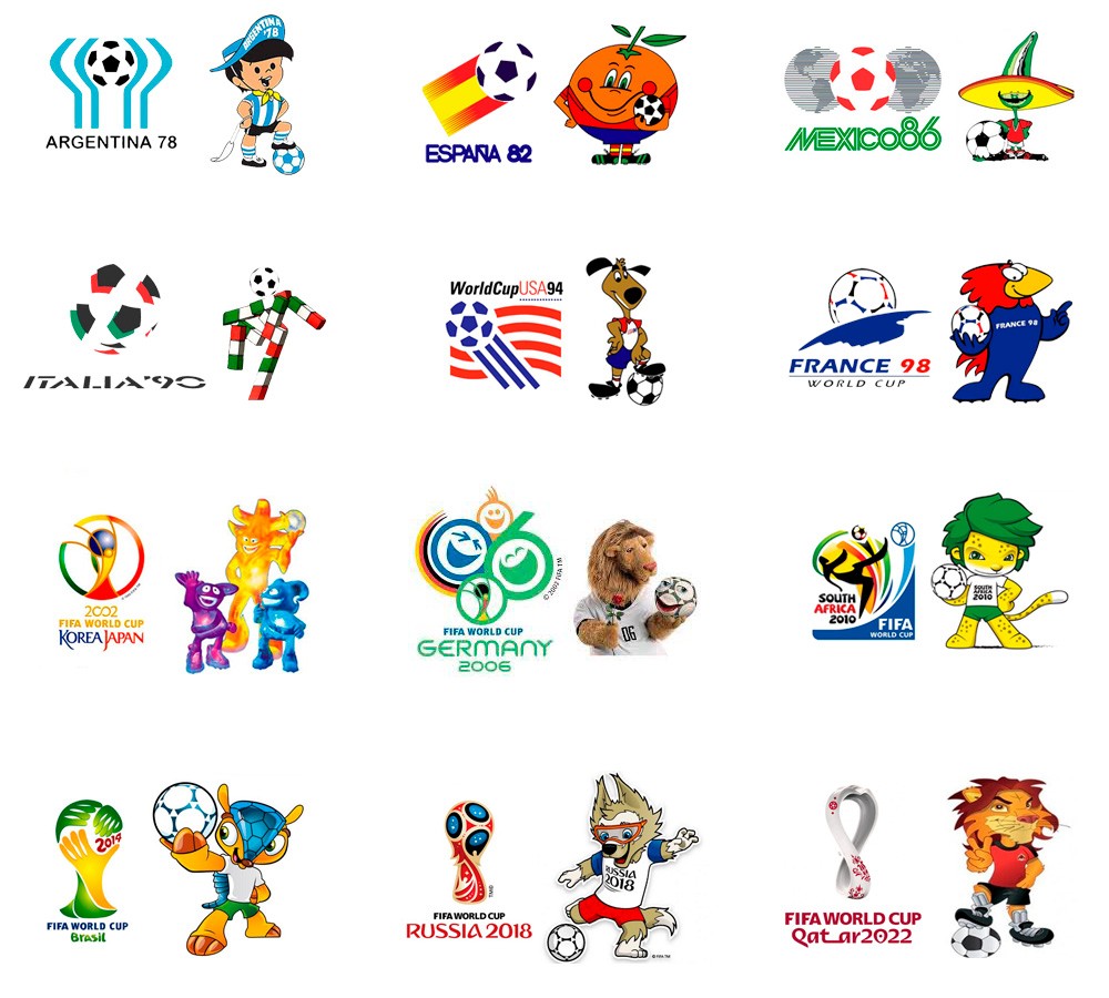
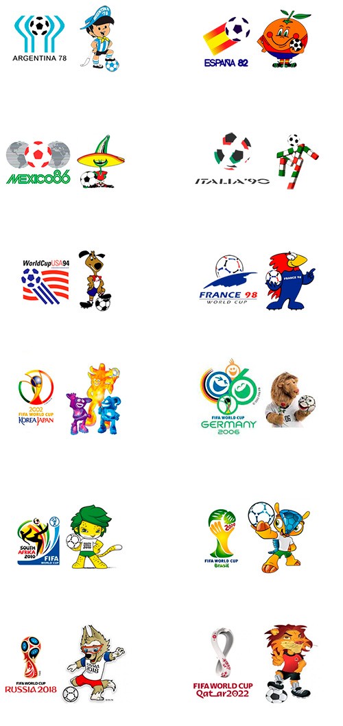
A good example of the use of mascots can be seen in the soccer championships for the FIFA World Cup.
Each country tries to show the world its spirit, culture and tradition through its graphic identity.

Below I show you the mascots and the emblems of the respective sede.

Mascot Logos FIFA World Cup

The following types of logos (emblem, shield, badge, and medal) are not necessarily logos, although some function as such.

A logo can be made up of an emblem, but an emblem is not necessarily a logo, rather it is a much more comprehensive concept.
The same concept applies to shields, badges and medals.
All these types of logos grant prestige, distinction and special recognition.
That is why many companies decide to take advantage of these concepts and design their brands using These guys.

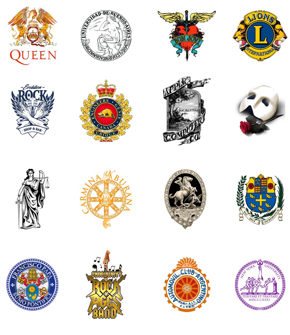
7. Emblem

The term emblem comes from the Greek language and means "what is put inside or enclosed", since they were generally inside rectangles or circles.

In ancient times, emblems were enigmatic drawings that told stories through quite complex designs and provided with many details, accompanied by a title and an explanatory text.
They were made by woodcut or intaglio.

At present, they are widely used as a logo or seal to represent institutions of great prestige and trajectory. We can find them in very exclusive universities and clubs, which claim to show their ethical and philosophical values through a solid image that represents them.

They are also used to graphically represent ethical and moral values, such as Justice, Freedom, Independence, equality, etc.

Emblemas Logos
Emblemas Logos

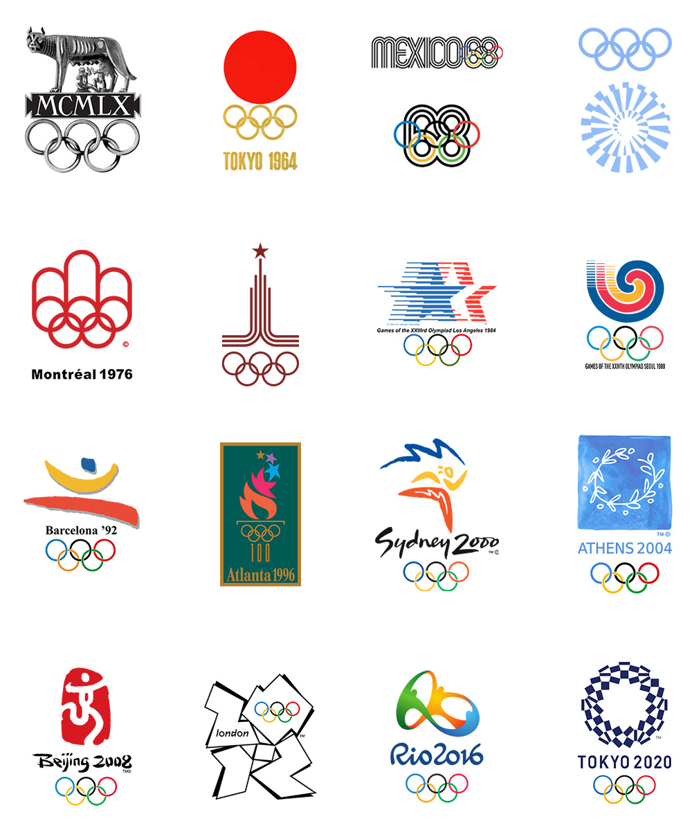
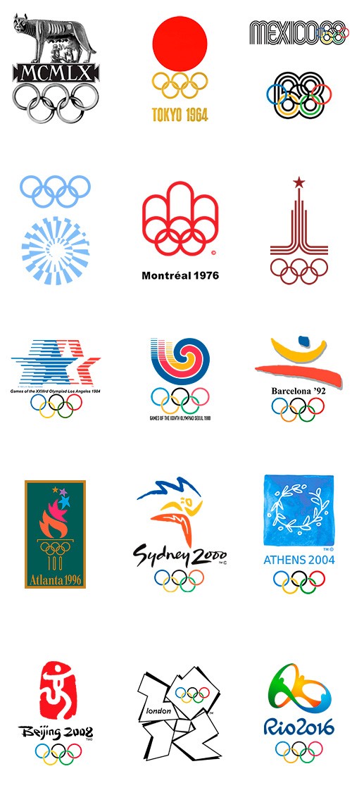
A very frequent use of the emblems can be found in the commemorative designs of world events such as the Olympic Games.

Like the mascots, these emblems are intended to show the world the philosophy and spirit of the city they represent and also generate many advertising and merchandising products.

Emblemas Juegos Olimpicos

8. Shield

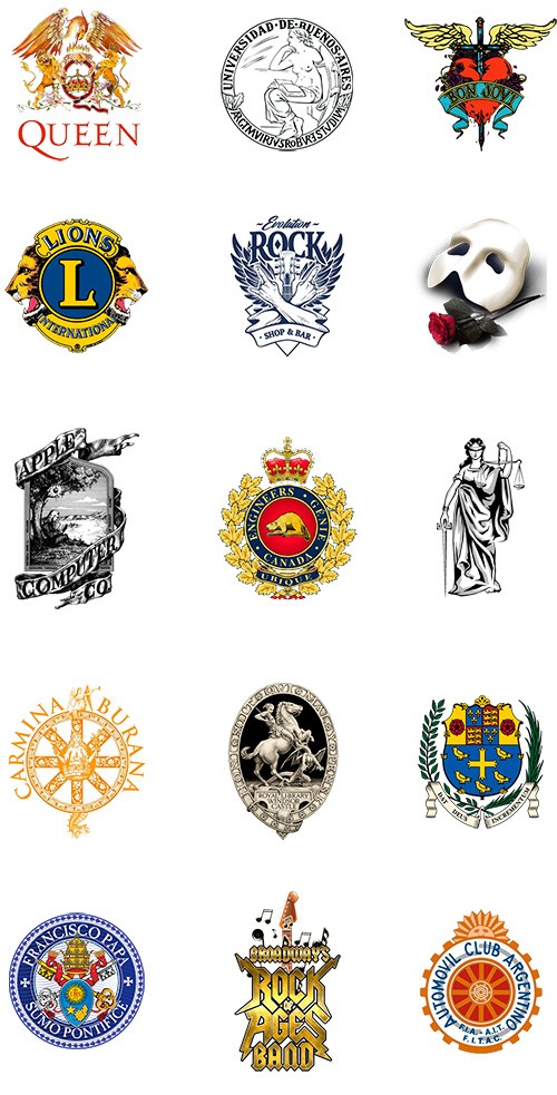
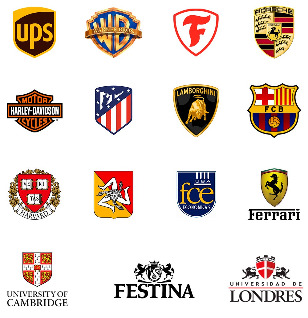
The shields are a type of emblem that refer to the ancient heraldic shields, symbols of belonging to a family, country, region, association or moral ideology, with a strong bond of identity and belonging.
They are directly associated with the coats of arms used by warriors in battles, and from them they acquire their most characteristic feature: their forms.

Shields are used as national symbols to represent countries and regions, as well as by sports clubs, universities, automotive companies, political parties, and religious and social groups.

Unlike emblems, shields have a much more simplified design.
They contain drawings that convey a message or represent identity, loaded with high semantic and allegorical content.
That is why some companies choose shields in their designs of its brands to transmit strength, security, trust, trajectory, luxury and exclusivity.

Logos con Escudos
Logos con Escudos

9. Insignia

An insignia (from the Latin insignia, which means "emblem, symbol, insignia, honorific mark") is a distinctive mark of belonging to a group, rank, rank or function.
It is a symbol or sign of personal power, status or function of a certain social sector.
There are several types of insignia such as flags, decorations, awards, accolades, crowns, cockades and shields.

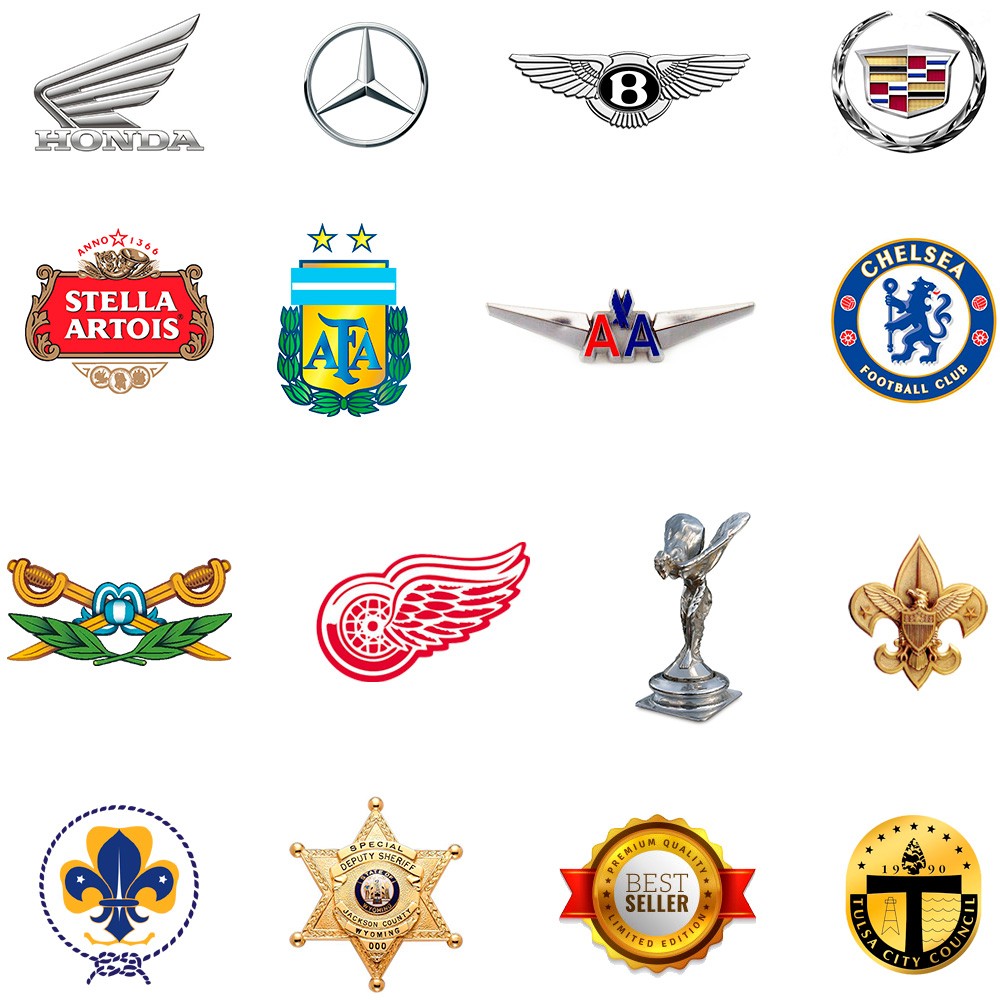
In graphic design, badges fulfill a similar role to emblems and shields, but their shape and complexity of design vary.
It is very common for brands with badges to contain graphic elements such as wings, stars, crowns, medals, banners , flags, laurels and ribbons, all of them distinctive and decorative elements.

Some companies use badges when designing their brands to show a high-quality image, and make their customers feel worthy of belonging to a certain select group, or having access to a higher quality product.

Insignias logos
Insignias logos

Insignias are generally made of metal but they are also very frequently stamped or embroidered on flags, uniforms and clothing.
They are very chosen in automotive brands or luxury products and also in the military and sports environment.
Virtual badges are also used to reward the best buyer / seller or follower in online stores and social networks.
Insignias aplicadas

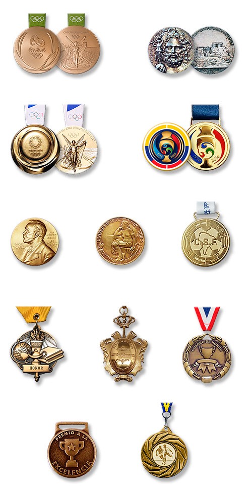
10. Medal

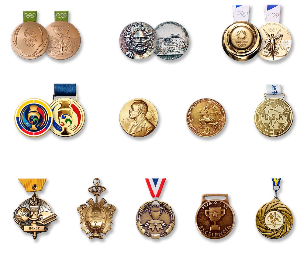
The medals (from the Italian "medaglia" which means "coin or prize") tend to be metallic discs, similar to coins, although with a larger diameter and pronounced relief, that incorporate some type of symbol or distinction.

They can contain logos, shields, emblems and legends.
Medals are quite similar to emblems, shields and badges in terms of the concept they represent.
They are always limited to a round, oval or rectangular shape, and generally go Accompanied by a ribbon to hang from the neck or put on clothing.


A matter of honor

The medals are issued for various purposes, such as a badge that recognizes a person in the military, religious or civil spheres.
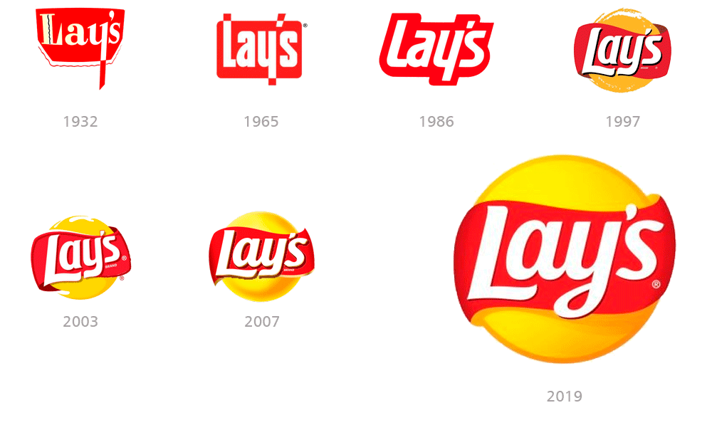
They are also used as an award in sports, educational or business competitions, or as a commemoration of an important event or memory.
Therefore, a medal is synonymous with a prize, award, recognition, honor or decoration.

Conceptually, medals are highly prized and desired objects that are awarded to special people: the best in their class.
They are awarded at important ceremonies and events or at official events, and whoever receives them receives recognition that distinguishes them from their peers. .
This represents pride and added value to their curriculum and career, and causes the need to display them as a trophy or distinction.
The type of material of the medals represents the hierarchy of the award: gold, silver, bronze, etc.

As for the graphic design of the medals, we must consider that they are three-dimensional objects of small size and minted in metal in a similar way to coins.
We must choose monochrome designs (although some incorporate color) and that can allow the use of reliefs.

Medallas Logos
Medallas Logos

Final conclusion

I hope you have enjoyed this article and it has been useful to you.
Surely you will continue to call all types of trademarks logo, but at least now you know the differences and the possibilities of use of each one.

If you wanted to have your brand and you consider that I am a suitable professional, do not hesitate to contact me and I will gladly advise you.

In the Related Articles section below, you will find many articles with specific topics that complement the one you just read. Thank you!

>>> I WANT MY LOGO <<<

Packaging posavasos